fogbound.net


Sat, 9 Dec 2017

Laser Menorah

— SjG @ 6:49 pm

You know, this title is misleading. The reality is a whole lot more boring. Maybe next year, I should take inspiration from the title.

This is more of a lazy Saturday afternoon project. I wanted to use some designs that I’ve been kicking around. So I took a sea of hexagons and a tree in Affinity Designer and mucked about for a bit until I had something where I more or less liked the look.

Next, I grabbed a slice of poplar (available in 8″ x 24″ x 0.25″ slabs at Home Deport, as “Hobby Poplar”) and drove over to CRASH Space. While it’s mega-take-apart-day, I scurried over to the laser cutter. I converted the design to PDF, loaded it up in Corel Draw, used the Epilog printer-driver, and sent it to the laser cutter. The poplar cuts very nicely.

Here’s a link to the PDF of the laser-cut portion, if you want to cut a copy yourself.2017-12-09-hexonorah-cut.pdf

I brought the pieces home, sanded lightly, drilled a few holes, and mounted the vertical piece onto the base, carefully mis-aligning it with the major axis of the elliptical base. Ah well.

I drilled holes where I would mount the candle holders themselves (after all, poplar is pretty, but not ideal as a holder for things on fire). For the actual sockets, I used some nice quarter-inch brass compression caps (also from Home Depot). I drilled a center hole, pushed through a brad, and then soldered it with a torch.

Next, let things cool, dried off the sockets, and put it all together.

The final result is not as attractive as I had imagined it. It’s a little … I dunno, squat? Perhaps the next iteration will have more dramatic tree-like branches emerging to hold the candles.

OK. Next year, forget the design. We’ll just go with lasers.


Tue, 29 Sep 2015

Doorbell

— SjG @ 9:14 pm

The Quagg Wedding Chapel has had a cheap wireless doorbell system, and over time the plastic case for the button itself got corroded and ugly.
db01

Aha! This looks like a good Saturday project!

So, I disassembled the plastic button to get at the actual circuit board. Then I selected some nice wood stock and measuring devices, and started designing.
db02Screen-Shot-2015-09-29-at-9.51

As mentioned before, my primary fabrication/making tool here is my Nomad 883 CNC device. I create my designs using Moment of Inspiration (MoI), convert them to GCode using MeshCAM, and carve them from wood, plastic, or metal with the Nomad.

First, I cut the heart-shaped button piece. This was cut from a piece of recovered Red Oak (the plank had spent some years being a wine barrel). As you can see, to prevent the cut-out piece from breaking free and rattling around before the surface was completely carved, I left some connector supports. They were cut away later.
db03
Next is the main body of the piece, cut from the lighter wood (I think it may be ash). This is a two-sided cut: the basic shape of the button holder is the one side, and the hollowed out interior with areas for the button and circuit board is the other. There are elaborate means that can be used to make a very precise two-sided cut (Carbide 3D sells their recommended “flip-jig”, which is accurate to around 1/100th of an inch, but I don’t have one). For this project, however, the alignment of the two sides only needed to be within a millimeter or two, so I did it mostly by eyeball.
db04
You can see there were two attempts here. The first time, I used an 0.0625″ ball cutter. The thin cut around the edge got clogged with chips, and skipped. The second attempt, I used an 0.125″ ball cutter and vacuumed a few times during the process.
Next, I flipped the piece, and did the hollowing cut. This used an 0.125″ end mill. I’m not positive I know what this lighter wood is — I set the carving parameters for as a soft wood, but I think perhaps I should have chosen hardwood. The feed-rate of the cut (the speed that the cutting bit moves) was a little too aggressive. Part of the way through the finishing phase, the cutter bound briefly and the servos skipped, resulting in an aborted cut. The carving was mostly complete and still usable, however. The damaged areas are on the inside of the hollowed pocket, so they aren’t visible when it’s all assembled. I figured it was good enough, and didn’t bother to redo the whole process.
db05
I sanded everything down a bit, and tested to see that the button portion had clearance. Yup! It works!
db07
db06
Now I separated the main object from the larger piece using an X-Acto knife. I smoothed the edges, and treated the pieces with polyurethane sealant. I slotted in the circuit board, and it all fit together nicely.
db08
Not shown are the screws and the mounting hardware that loops around the circuit board in the slots by the battery. I added that hardware, and, with a silent mental fanfare, I put it up!
db09
My final conclusion is that it’s kind of ugly, but in a much more homey/craftsy way than the corroded plastic it replaced. And hey! It works!


Mon, 25 May 2015

Half-toning and Engraving

— SjG @ 11:40 am

Consider a photograph or painting. We see a range of colors (or shades of gray) reflected that form an image. But since our eyes and brain are highly optimized for teasing coherent images out of what we see, a great deal of manipulation can be done to those colors and we will still see the original. Artists have exploited this capability for millennia, using areas of light and dark paints to hint at the details which our brains happily provide.

With the introduction of printing, techniques for “half-toning” emerged to convert a continuous image into a two-color (normally black ink and white paper) image that maintained as much as possible the appearance of the original continuous tone image. There are many photographic processes for making such conversions. I’ll discuss one simple example here, using digital instead of photographic techniques.

We start with an piece of a photograph. This picture is sepia toned and not extremely contrasty.
original

The first step we take is to convert the picture to purely gray tones. When we do this, we also adjust the contrast by shifting the the tones so that the darkest shade in the image is assigned to pure black and the lightest shade in the image is assigned to pure white, and all other shades are adjusted according to their position between the lightest and darkest shade.
gray

The second step involves superimposing a pattern over the picture. The pattern should have be a continuous repeating variation between light and dark — when we superimpose, we multiply the two images, so that the darker of the pattern or the photo dominates. In this case, I used simple straight lines, which are made with a sine wave luminance cycle between pure white and pure black.

screen

The remaining step is to look at each pixel, and decide whether it should be black or white. We do this by simply comparing it to a threshold. Is it lighter than, say, 50%? If so, then it’s white. Darker? Then it’s black. But 50% may not be the best place to position our threshold. We can try various thresholds to see how it comes out:

Here are a few observations that may be relevant at this point. At each of these steps, we made decisions which I glossed over. For example, when we adjust the contrast of this image, we chose a linear conversion. We could, instead, have used different curves to emphasize bright areas, dark area, or middle tones. We could have used histogram equalization which adjusts the image such that there are roughly the same number of pixels for each shade used (often used to bring out details).

Similarly, our overlay pattern needn’t go from pure black to pure white; by changing the ranges of this overlay pattern we are doing the equivalent of adjusting the tonal curves of the original image. We can also have a strong influence on how the final output looks. With a pattern that includes shades darker than our threshold, we will end up with the pattern throughout the final image (as in this case, our final image has lines across all parts of it). By having a pattern of only half maximum density, the lighter areas will not show the pattern:
screen-half

The overlay pattern can be many shapes other than lines (like concentric circles), and there can even be multiple overlays. Traditional newspaper half-toning uses two linear patterns like the one we used, but set at an angle with respect to one another, thereby creating diamond patterns. Newspapers chose this diamond pattern because the size of the pattern relative to the detail in the image determines how much detail winds up in the final image.

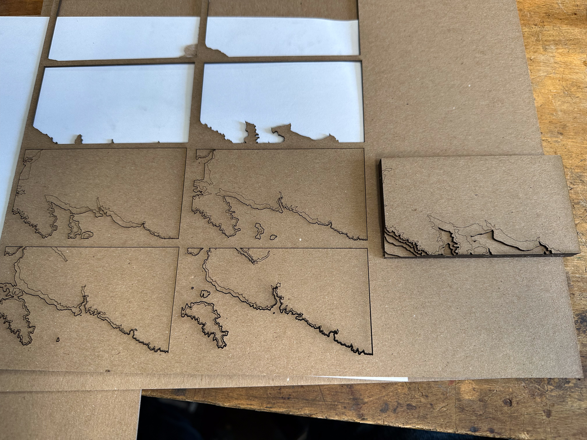
I tried to use the above techniques for generating 3D halftones or etchings. While it’s probably a project best suited for use with a laser cutter, I don’t have a laser cutter. I do, however, have a Nomad CNC router!

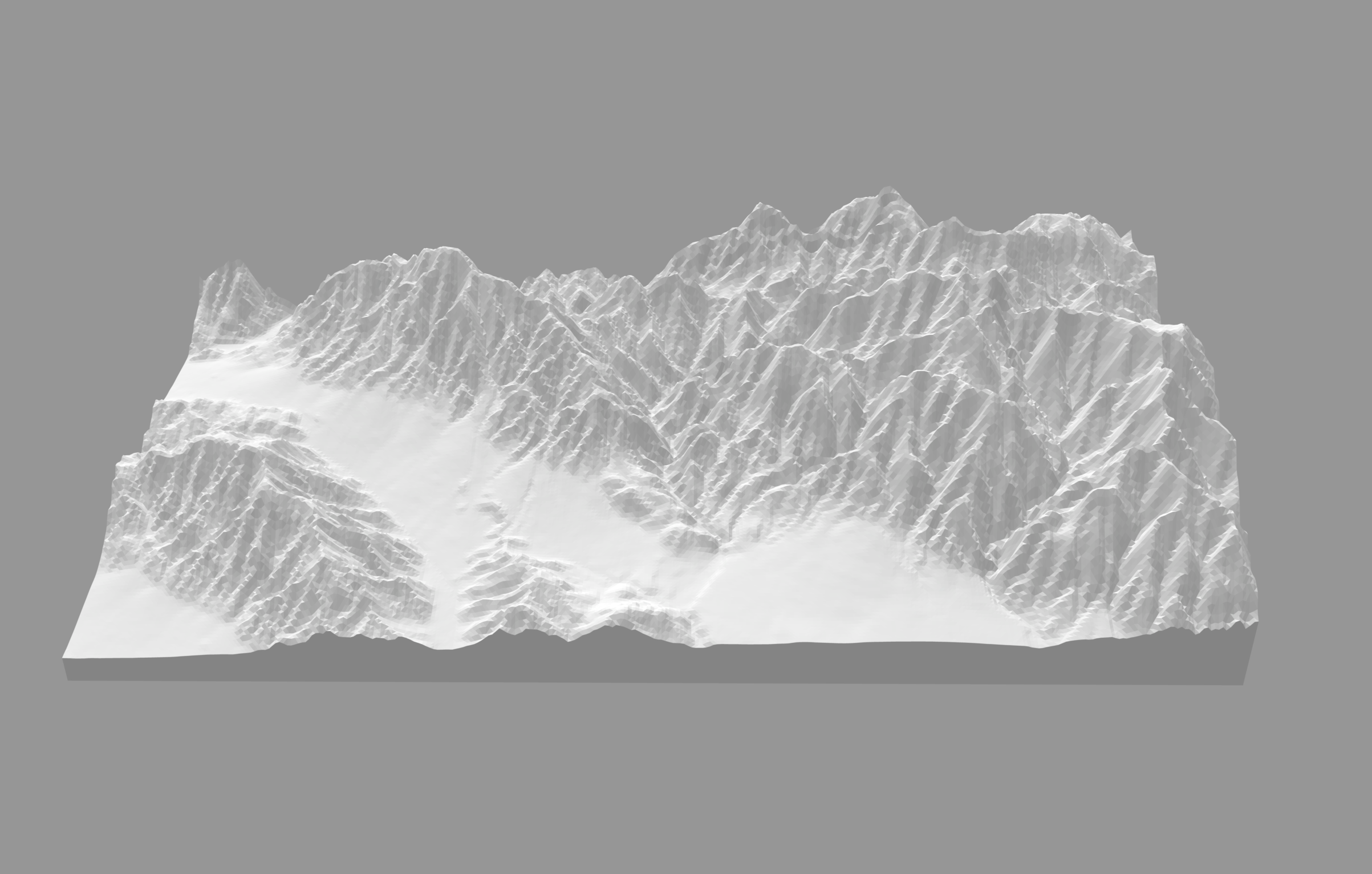
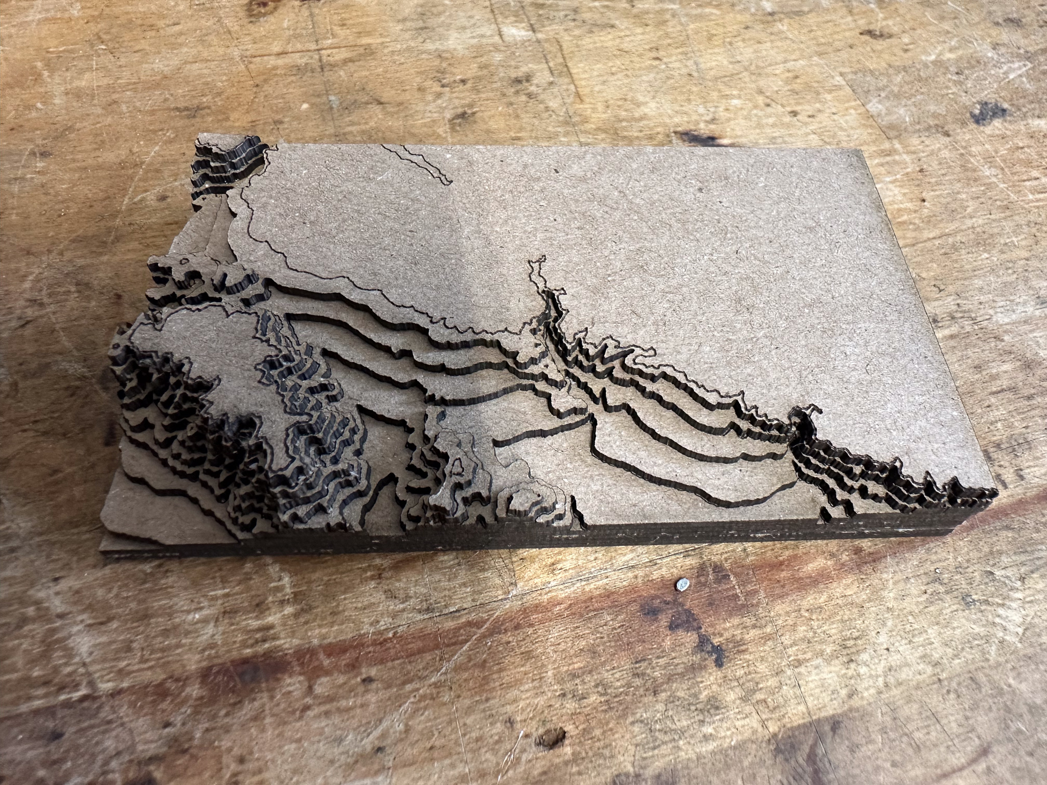
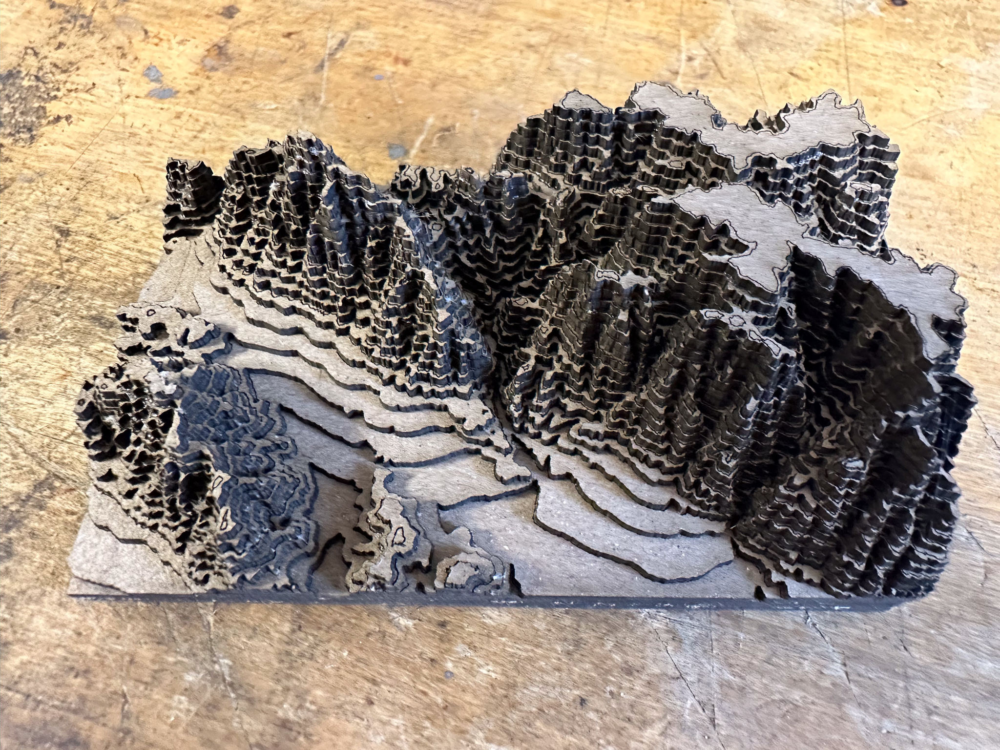
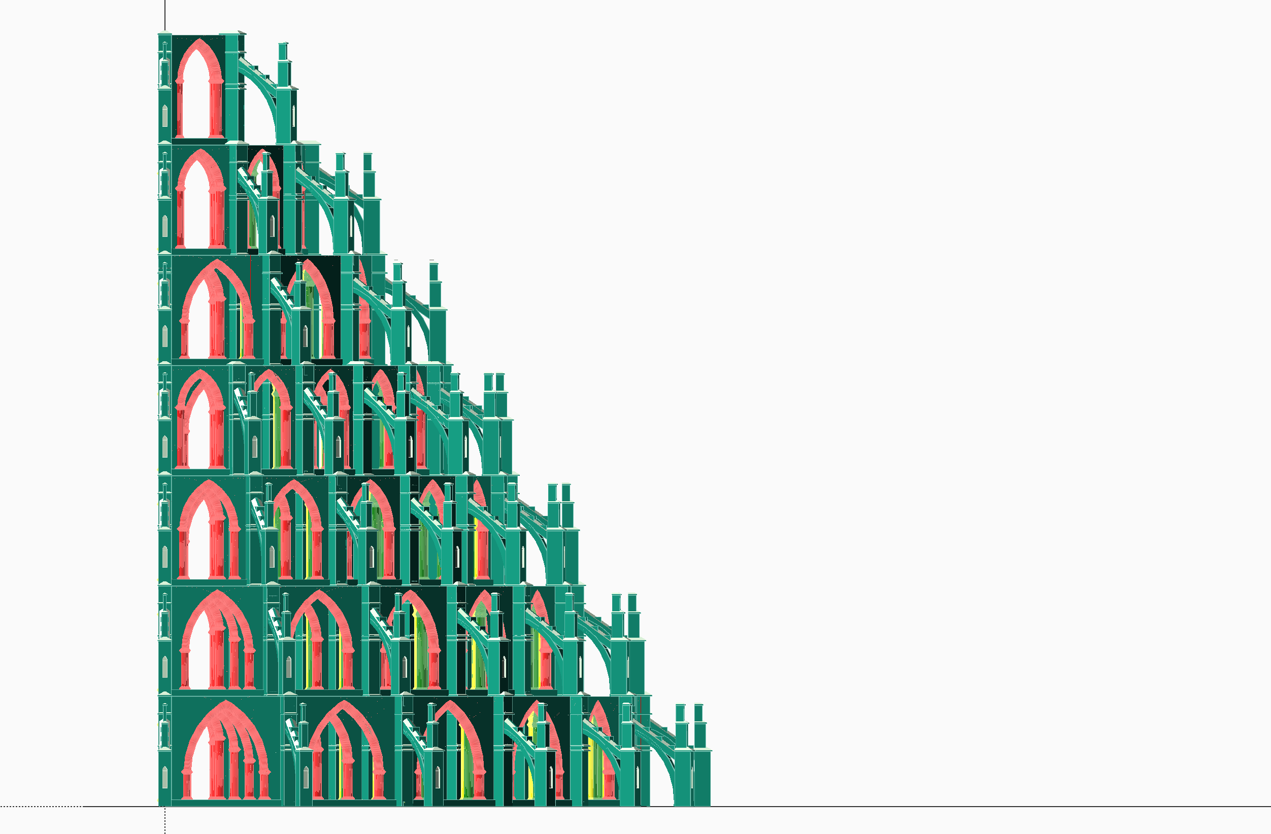
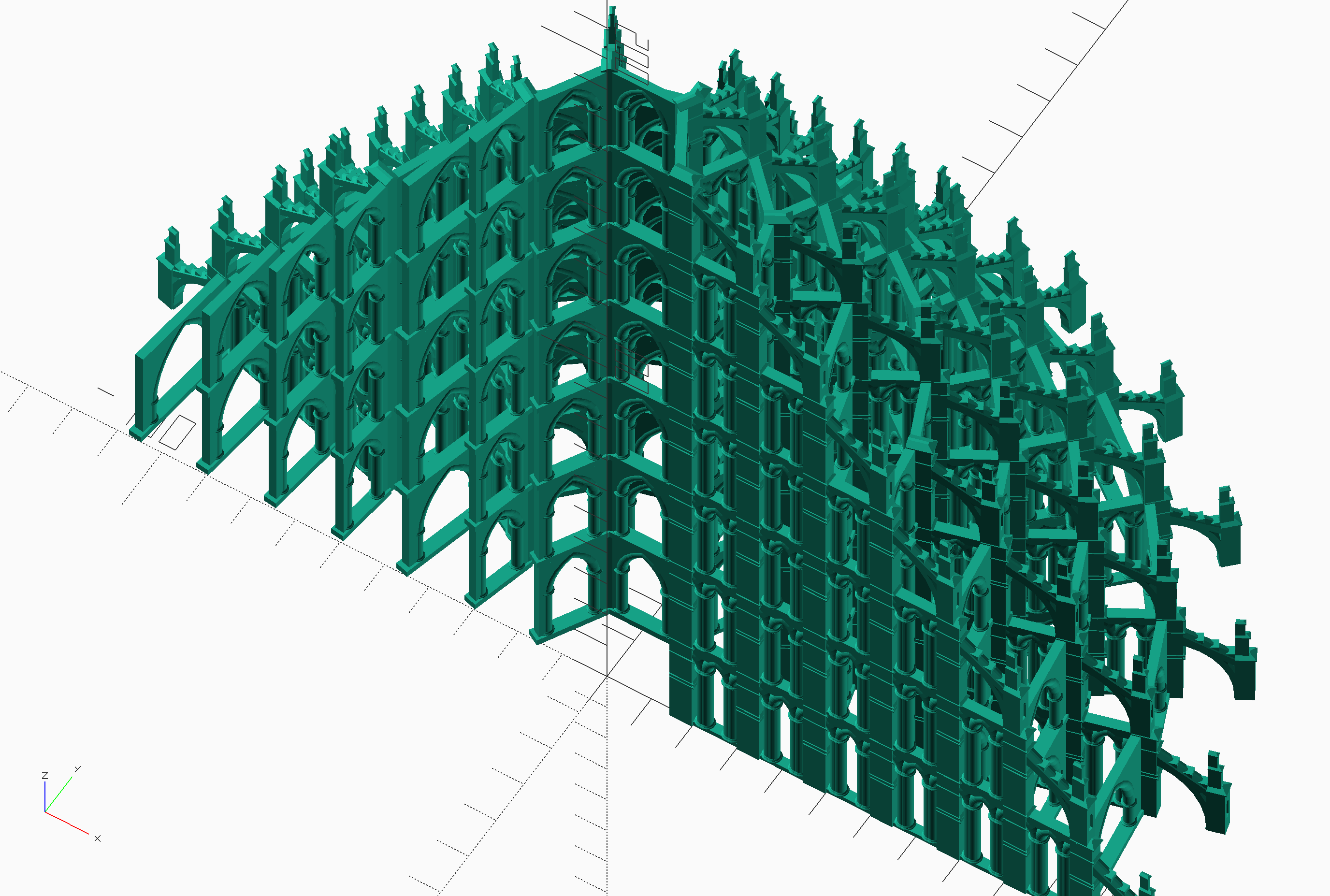
I wrote a short script that analyzes an image file, and converts it into a set of 3D ridges. My first approach looked at the image row by row, and created a groove with a thickness inversely proportional to the luminosity of the pixels in the row.

2015.05.25-12.18.41-[3D] 2015.05.25-12.03.47-[3D]
Result (click to view) Detail (click to view)

This works well in theory, but neglected to take into consideration some limits of my machine: the work area is 20cm x 20cm, and the smallest end-mill (cutting bit) I have is 1mm in diameter. This functionally limits my smallest detail to somewhere around 1.05mm. Add the fact that the wood stock I had on hand was around 8cm on its narrow dimension, and this results in an image that I can’t carve.

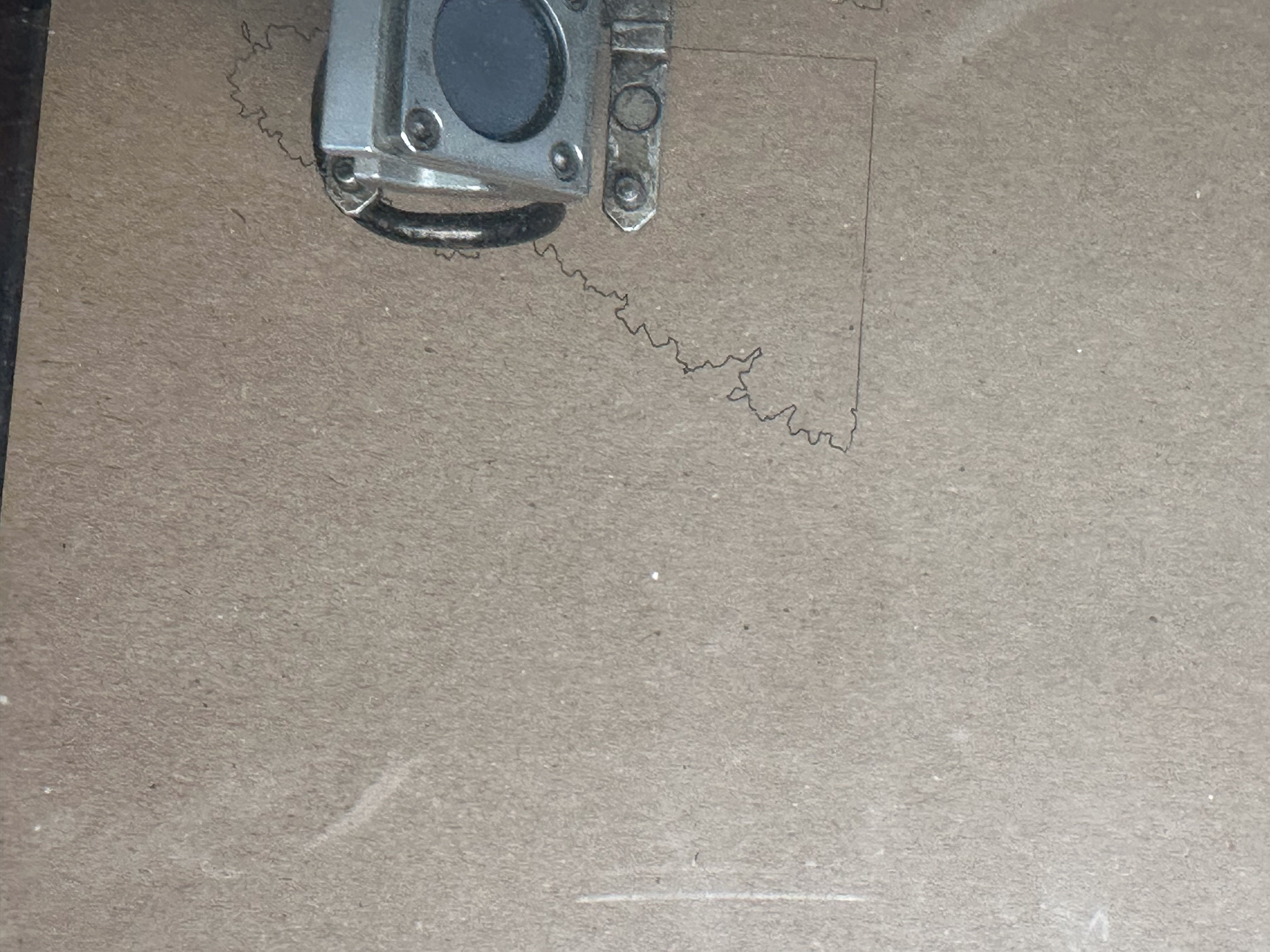
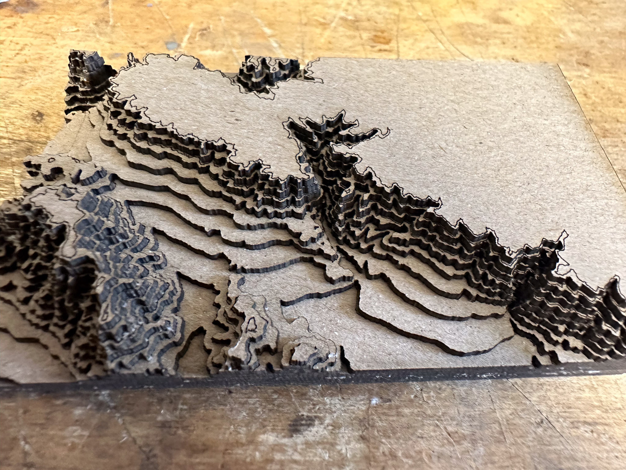
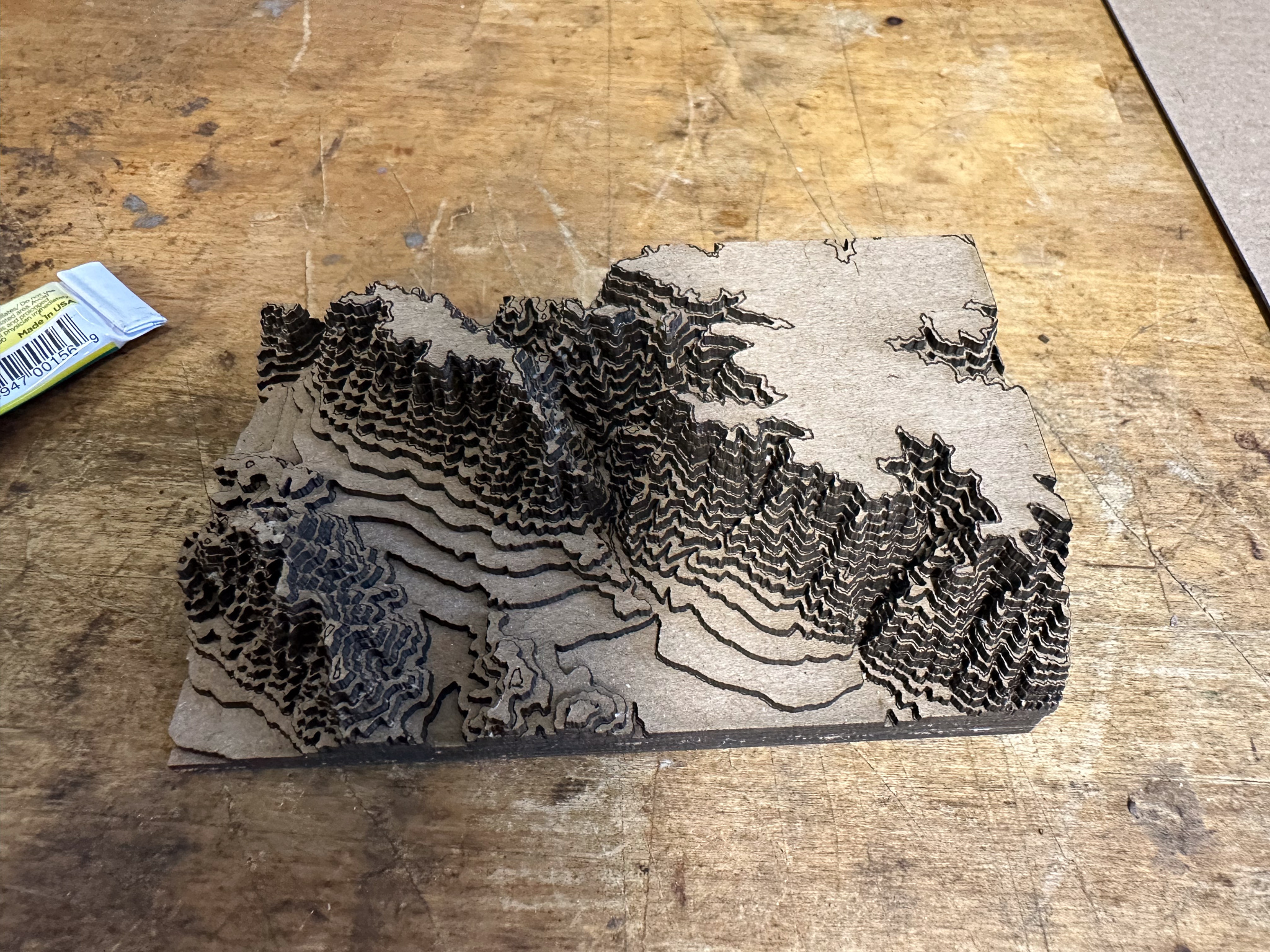
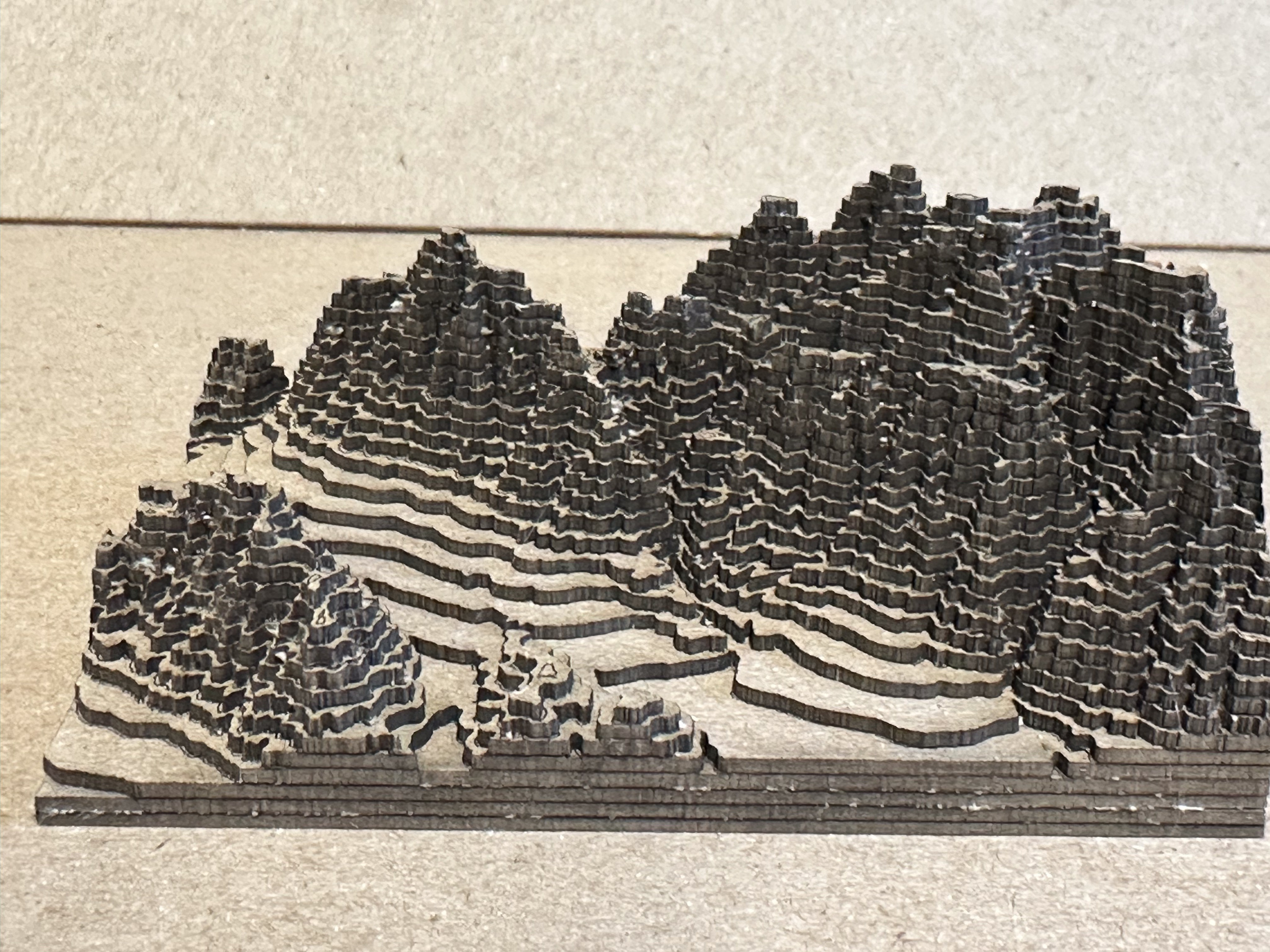
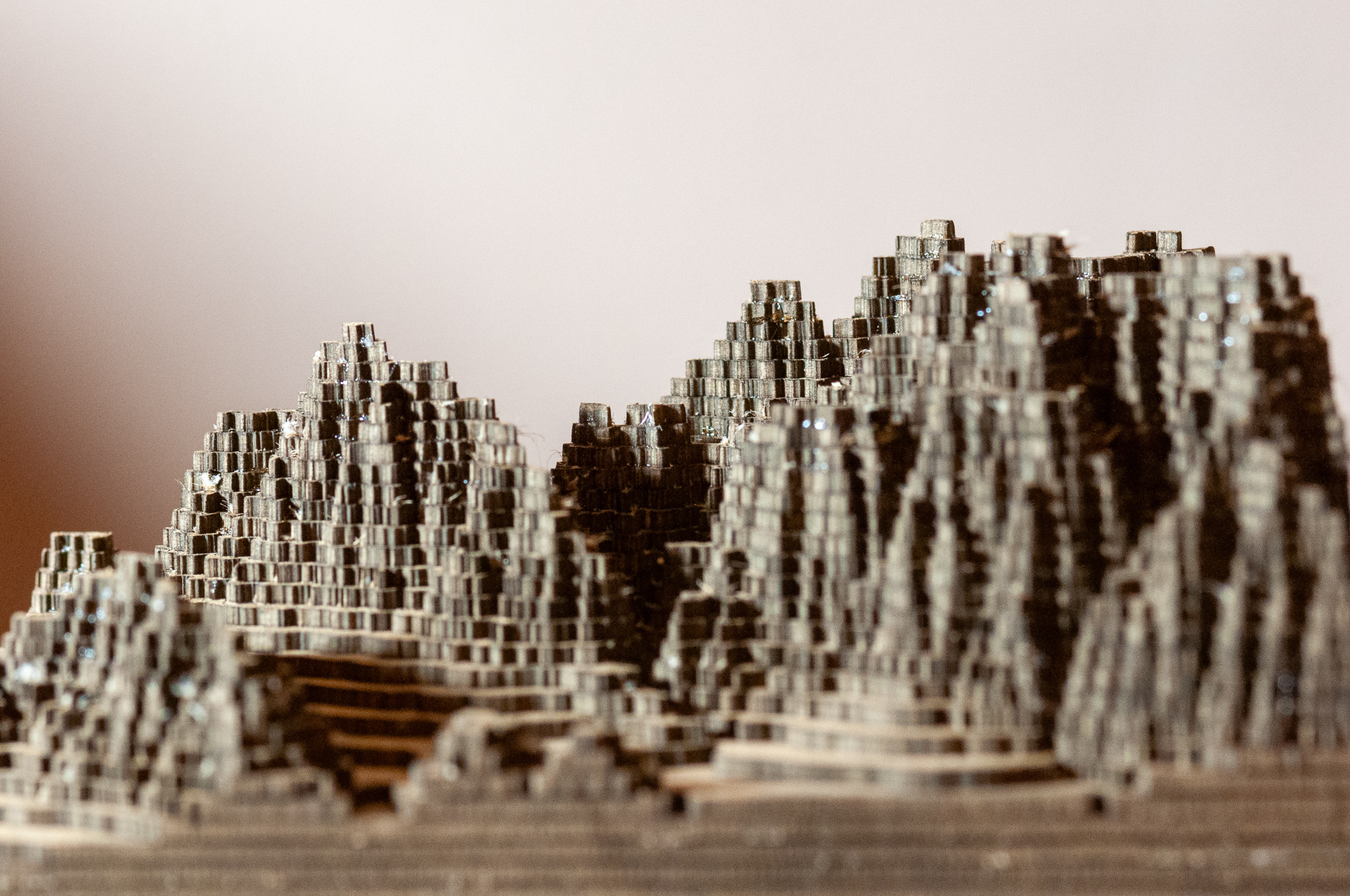
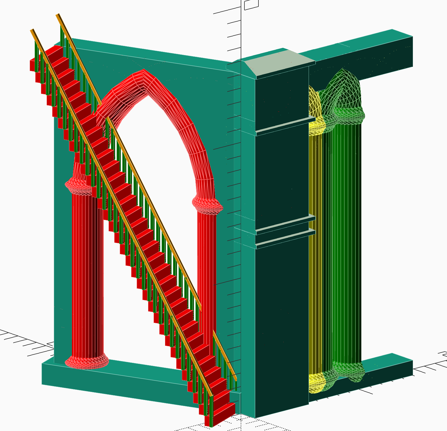
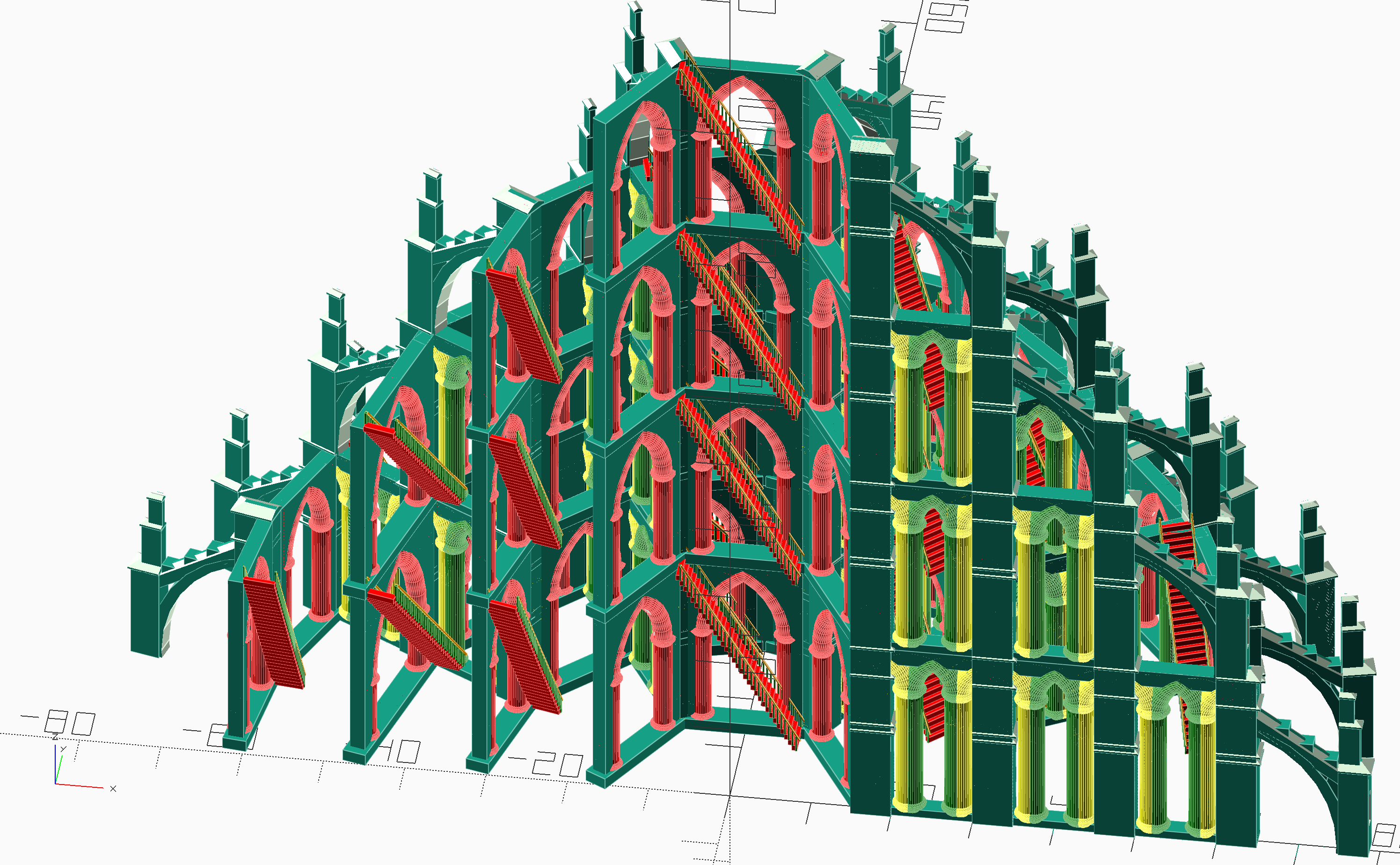
My next algorithm analyzes three rows of the image at a time. As it steps along the rows, it uses the average of the three pixels at each column (call them a, b, and c, where a is the top row). If the combined density is greater than 50%, a 1mm ridge is created. The ridge is thickened on the top by the average density of a + b, and thickened on the bottom by the average density of of b + c.

2015.05.25-12.13.16-[3D]

2015.05.25-12.09.26-[3D]
Result (click to view) Detail (click to view)

This algorithm provides something that’s within the resolution I can carve, but loses an enormous amount of detail. Furthermore, it requires harder wood than the birch plywood I tested on. I did some minor tweaking of the threshold, and here’s what I got:

Photo May 24, 12 07 22 PM

So at this point, I have a set of 0.5mm cutters on order, and need to track down some good hardwood stock to try carving. As always, details will be posted here if notable.


Sun, 8 Feb 2015

Further Adventures in Makering

— SjG @ 6:16 pm

When I last posted, I was playing with plastic and metal prints from Shapeways.com. So here’s an experience printing in a different material — gold-plated brass. As with last time, I used MoI modeler. I wanted to make a butterfly pendant for my wife for our anniversary. My initial try used an actual photograph of a monarch butterfly that I had taken in our garden. I traced the outlines, and created extruded forms for the wings. I then created the shape of the body, and a ring for the necklace chain to pass through.

When I uploaded it to Shapeways, however, I immediately ran into printability problems. I had misunderstood the limitations for different materials. When they say that the minimum dimension for an unsupported wire is 1mm in a given material, I had for some reason interpreted that as having a minimum cross-section of 1mm2. So, for example, I thought I could get away with a 0.5mm width if the thickness was 2mm. This interpretation was not based on their actual requirements. So it was back to the drawing board.

It turns out that using the actual dimensions was not going to be a successful approach. In the end, I bit the bullet, and did a complete redesign inspired by — but not matching — an actual butterfly. Since I was now dispensing with reality, I chose to make it more dramatic by having the wings all spread apart rather than overlapping as monarch actually hold their wings. The design that would be printable looks like this:
Screen-Shot-2015-01-13

I ordered the print three weeks before our anniversary, since the estimated turn-around was 10 days. In the end, it shipped in five days before our anniversary, but it didn’t actually arrive until the day after. Bummer. Then, while it was en route, Shapeways sent out an email extolling their new approach to precious-metal-plated items. Same price, better results. Well, thanks, guys. I mean, I know there has to be a transition between approaches at some point, but I wish it wasn’t between the time I’d placed an order and received my print.

Still, as even this shaky iPhone picture shows, the final result was OK.

Photo-Feb-08

(click on images for larger versions)

Coming up soon: some posts on a completely different path I’ve taken to 3D production. Here’s a hint.