fogbound.net


Tue, 27 Feb 2024

Cardboard Haberdashery

— SjG @ 5:42 pm

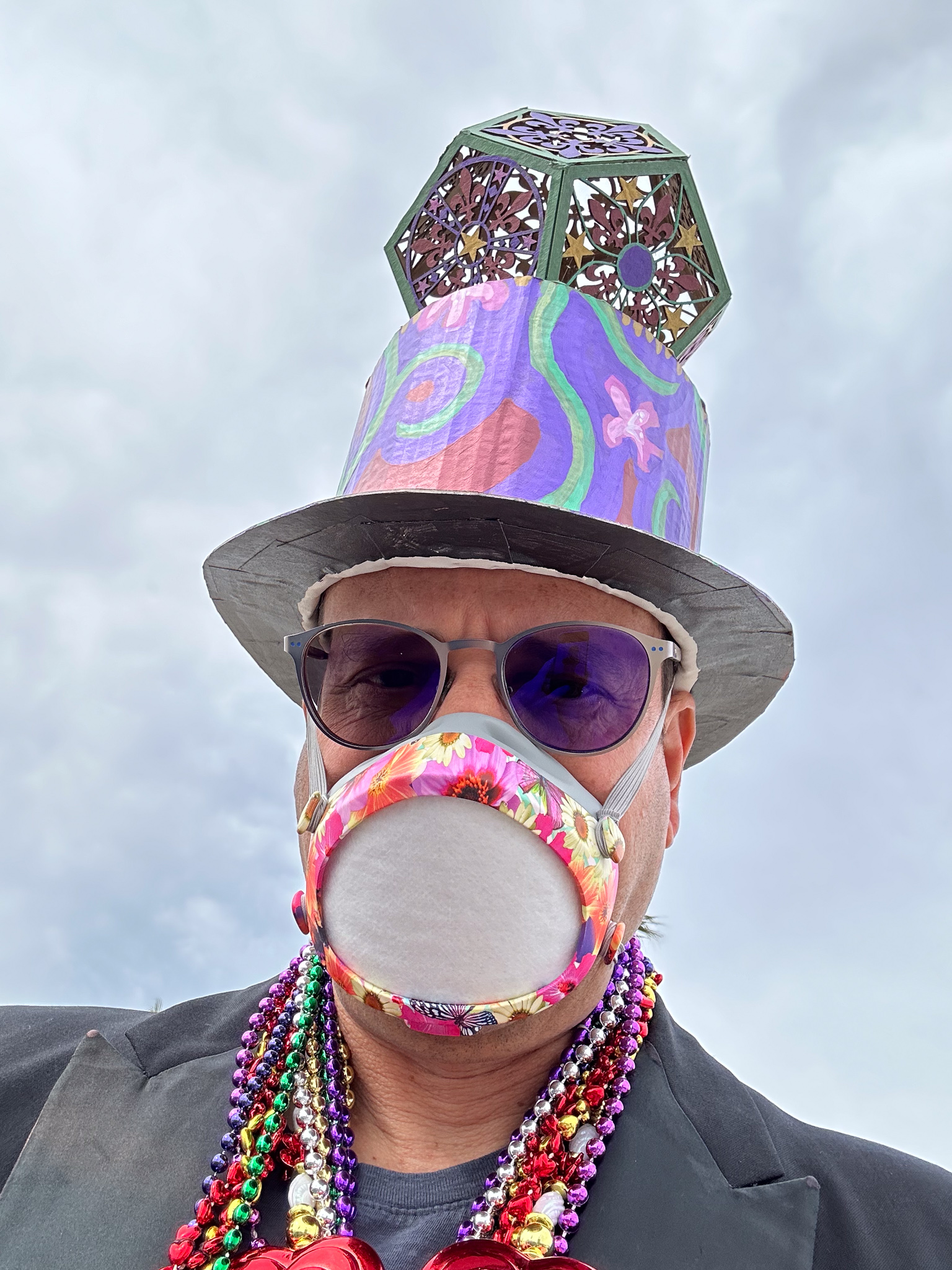
The annual Venice Mardi Gras parade was on the 25th (due to scheduling issues, that’s the midst of Lent this year!), so it was time to make a costume.

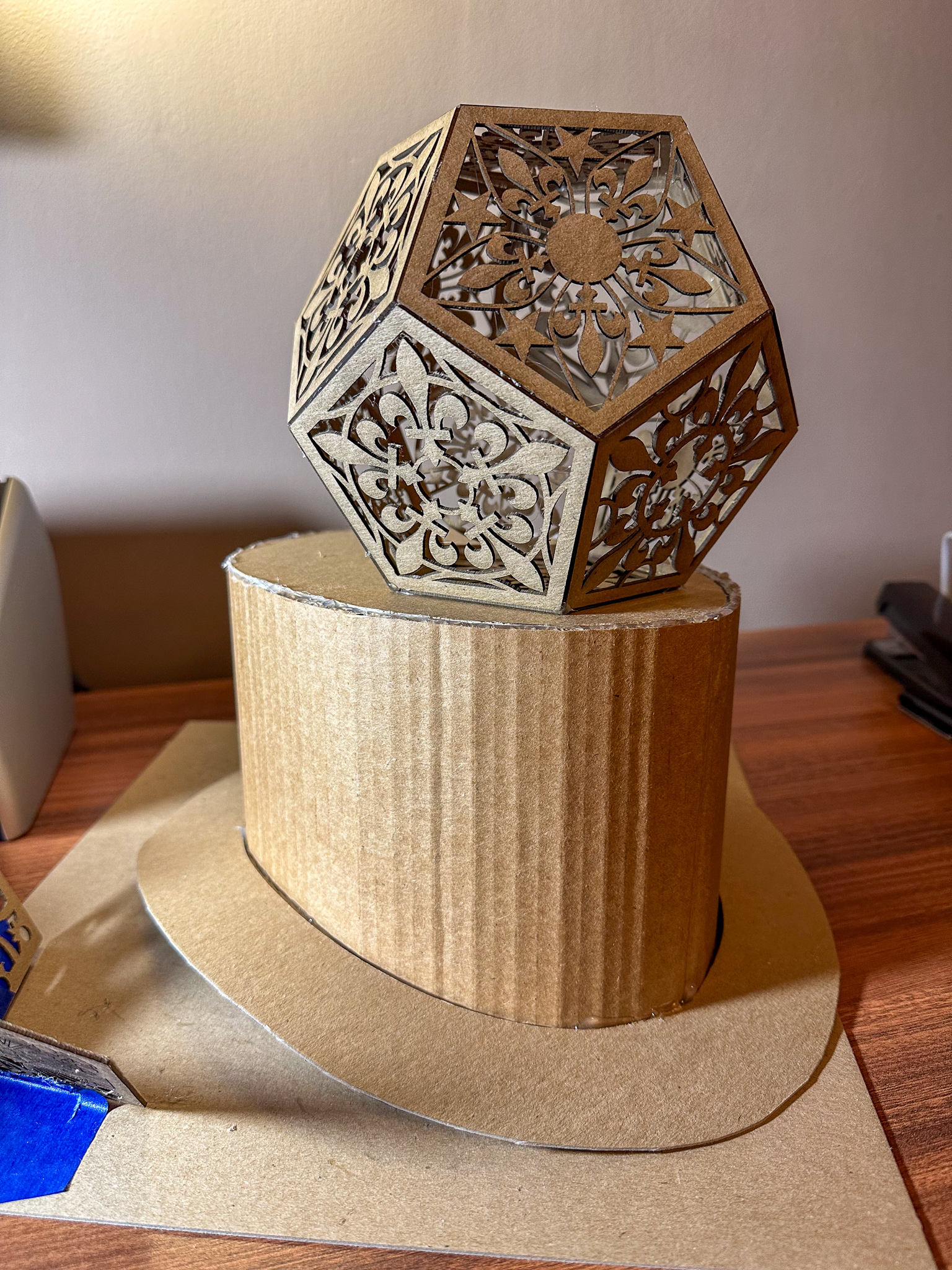
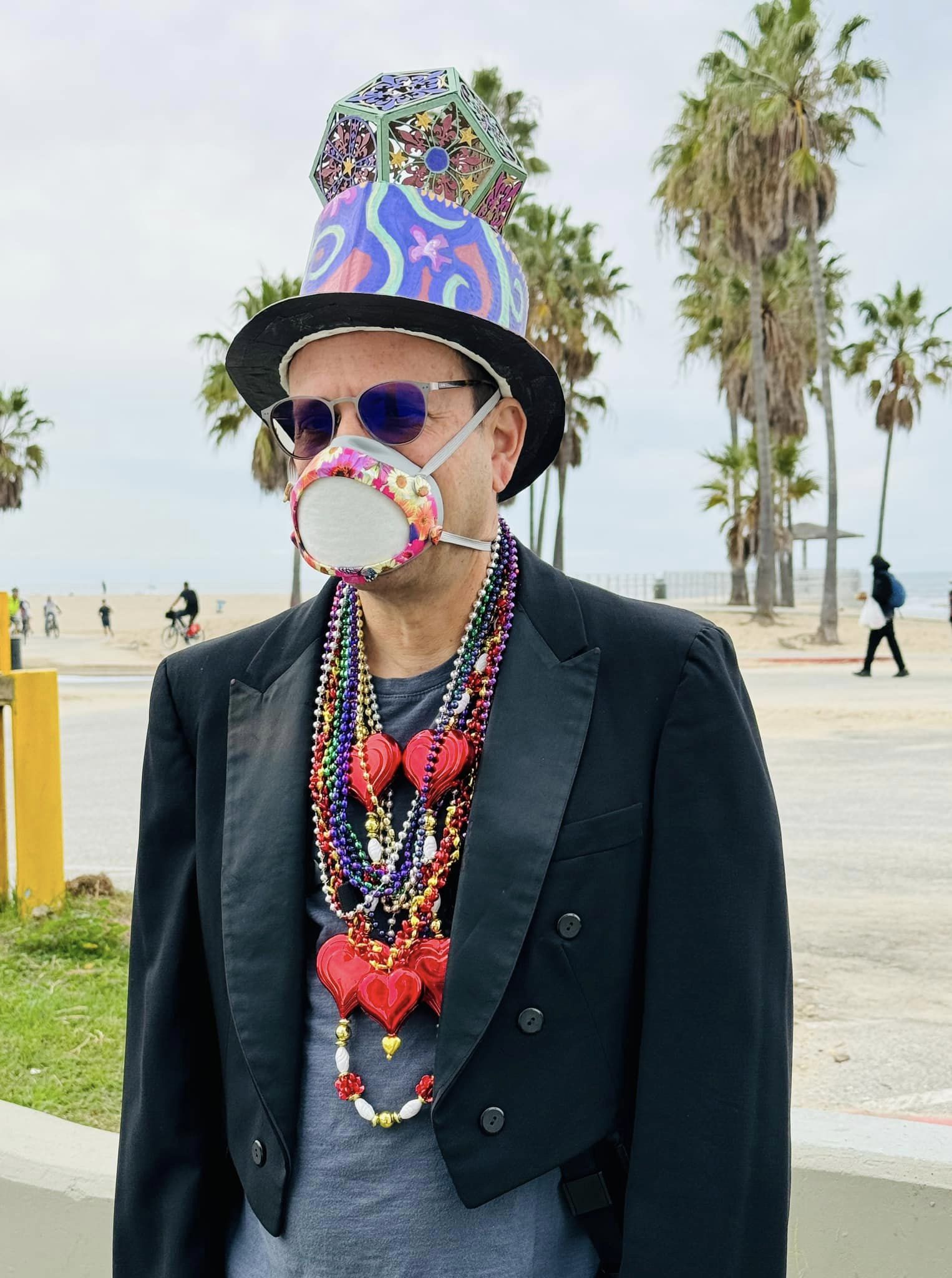
As the self-appointed official unofficial photographer, I always need to be able to wield one or more cameras, so my costumes tend to focus on some kind of headgear that won’t get in the way. Past costumes have included wild structures to hide a fill-in flash, wizard hats, a big papier-mâché fish, and the like. This year, since the theme is “Magical Mystery Trip,” I figured a variant on a top-hat would hint at magicianishness. A magical geometrical figure adds to the alchemical implications, so I put a Mardi Gras themed dodecahedron on it.

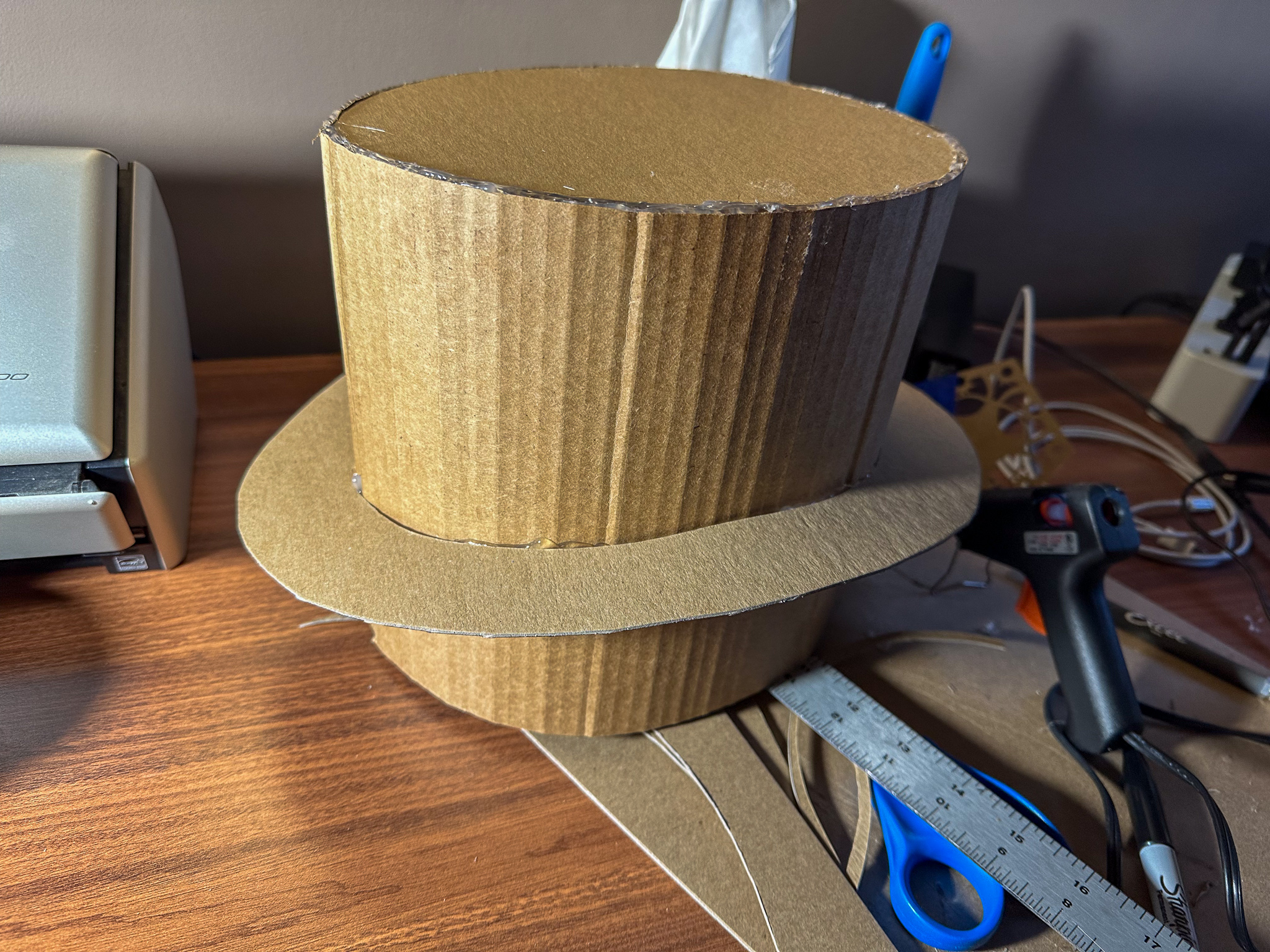
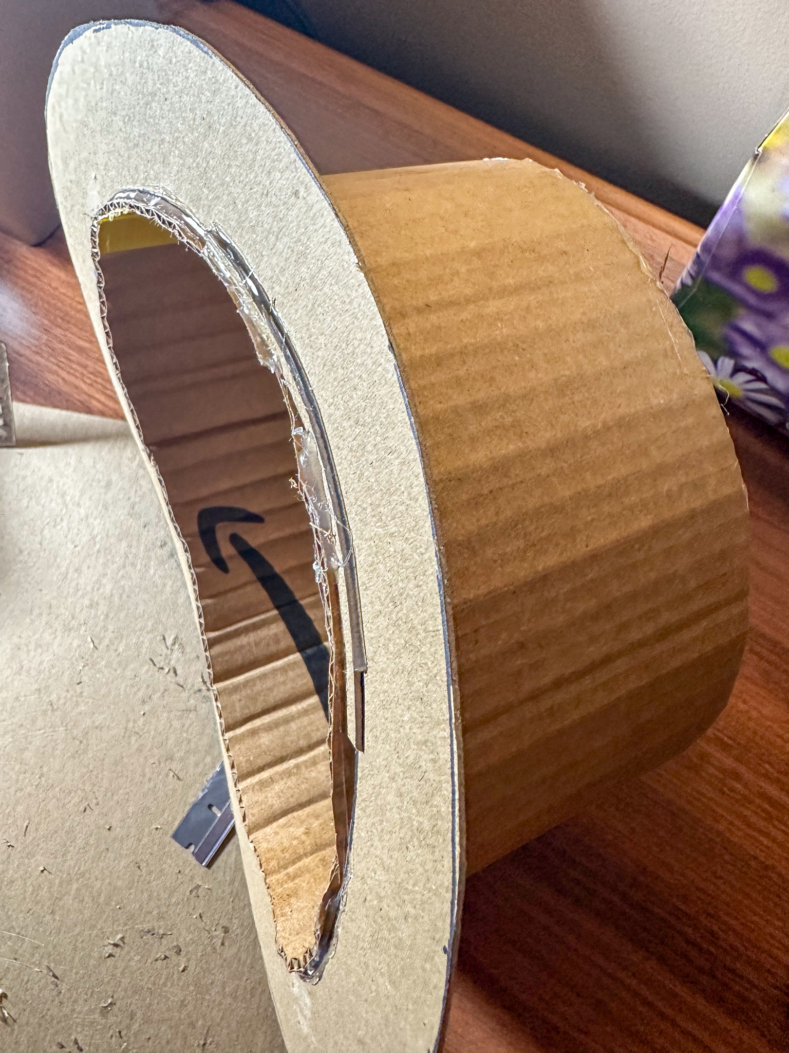
The top hat itself is made of cardboard. I started by measuring my head with a piece of string, cutting out a sheet from a delivery box (the corrugations pulled over the hard edge of the table to make it flexible), and creating a cylinder. Duct tape was used inside to hold it together. A top plug was hand-drawn, cut out, and hot-glued into place. Oh, so much hot glue. It’s great for imprecise work like this: it fills gaps, is adjustable for those vital few seconds, but hardens quickly into a pretty good secure bond. The brim was then drawn onto a sheet of chipboard, cut, positioned, and glued. After that, I cut the cylinder down to the curve with a razor blade, and taped in some padding with gaffer tape to help smooth that edge.

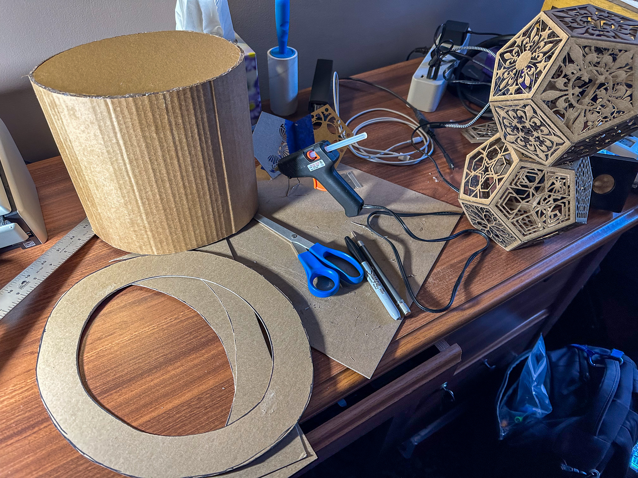
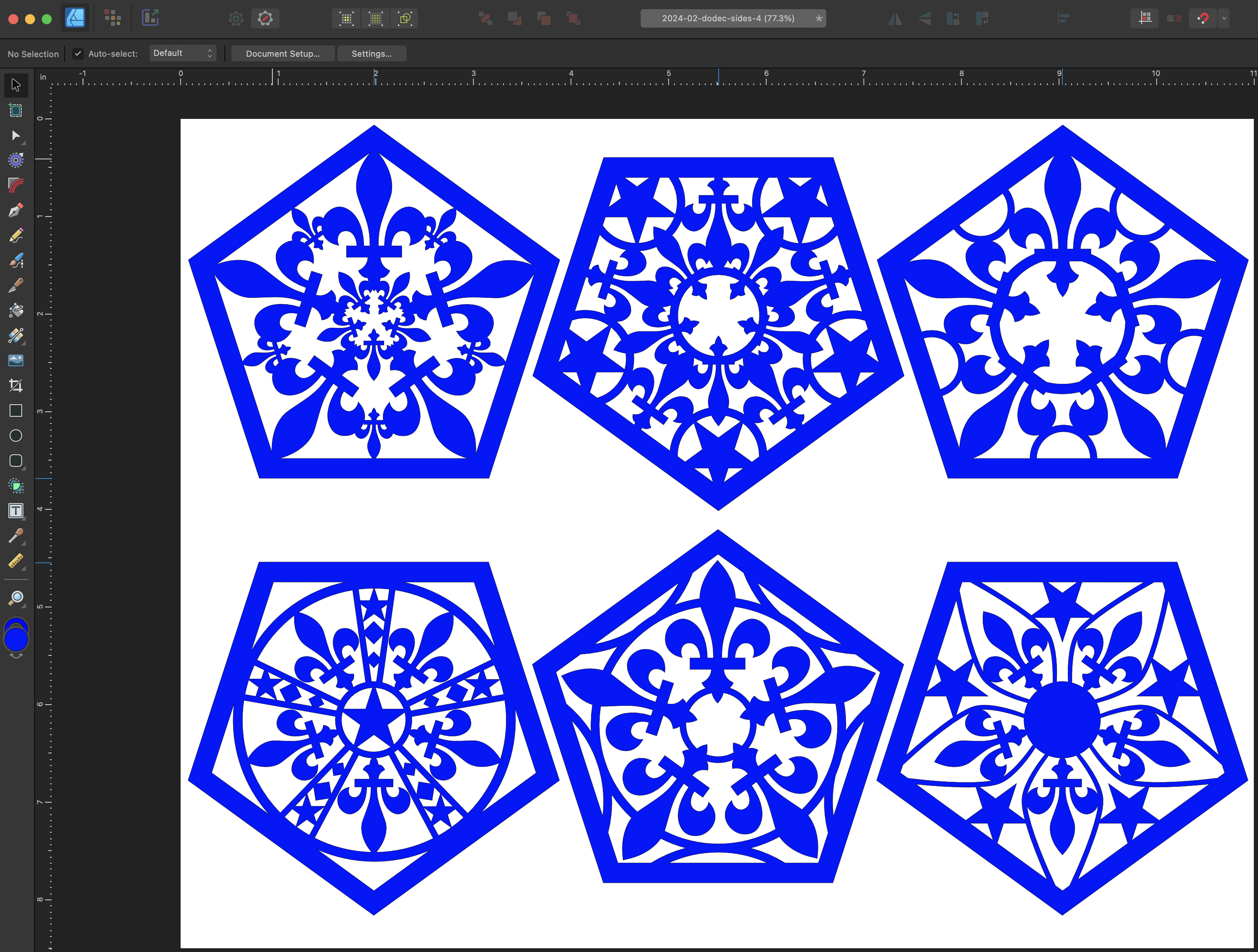
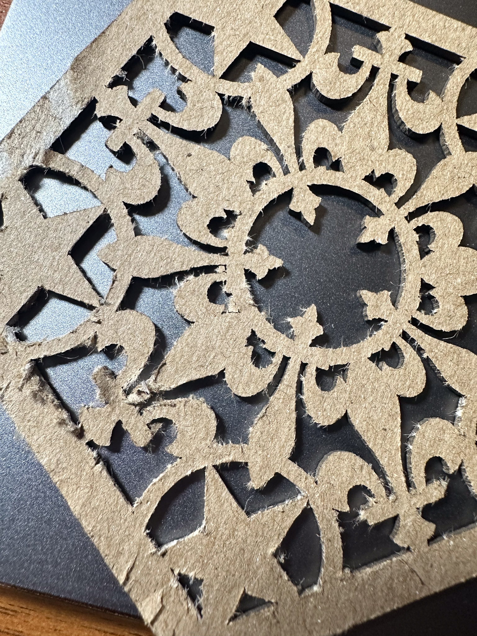
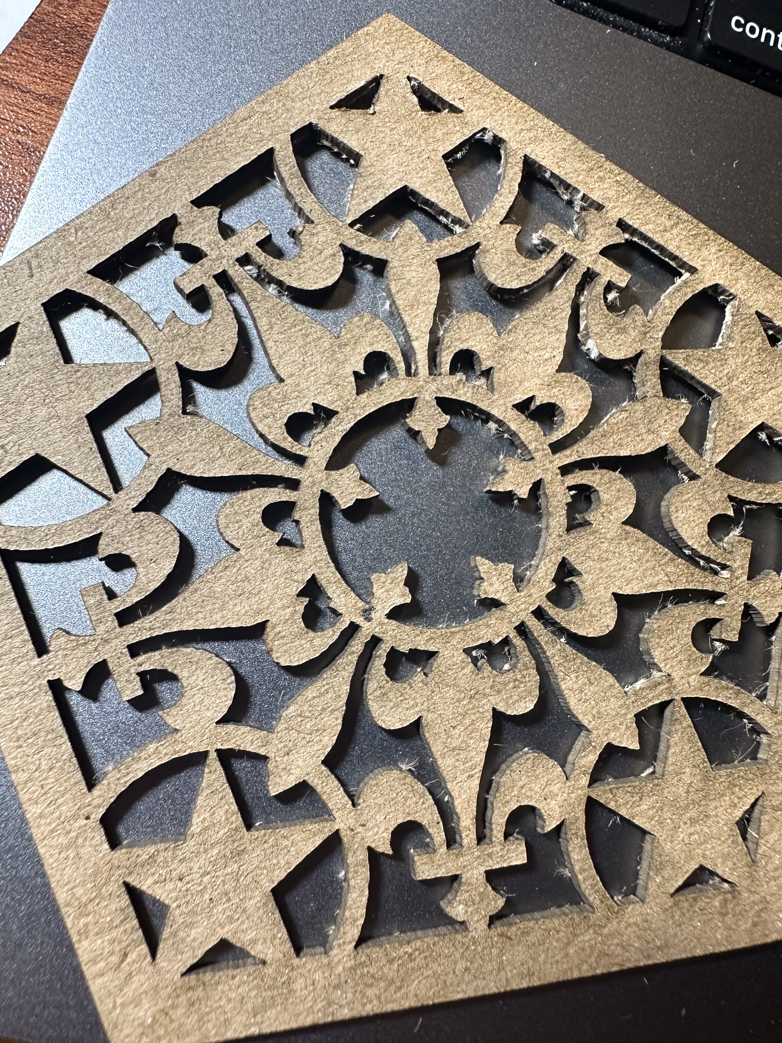
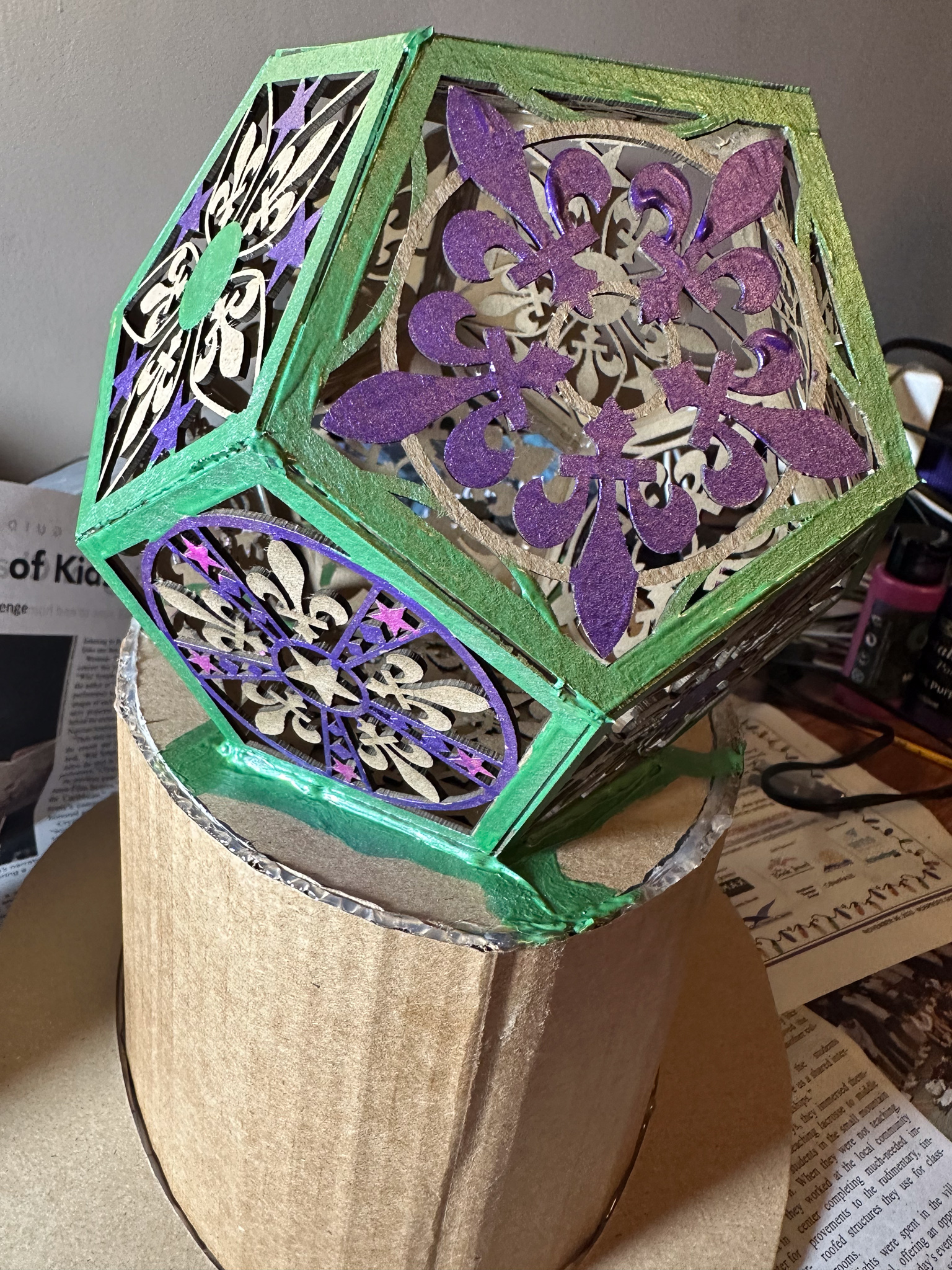
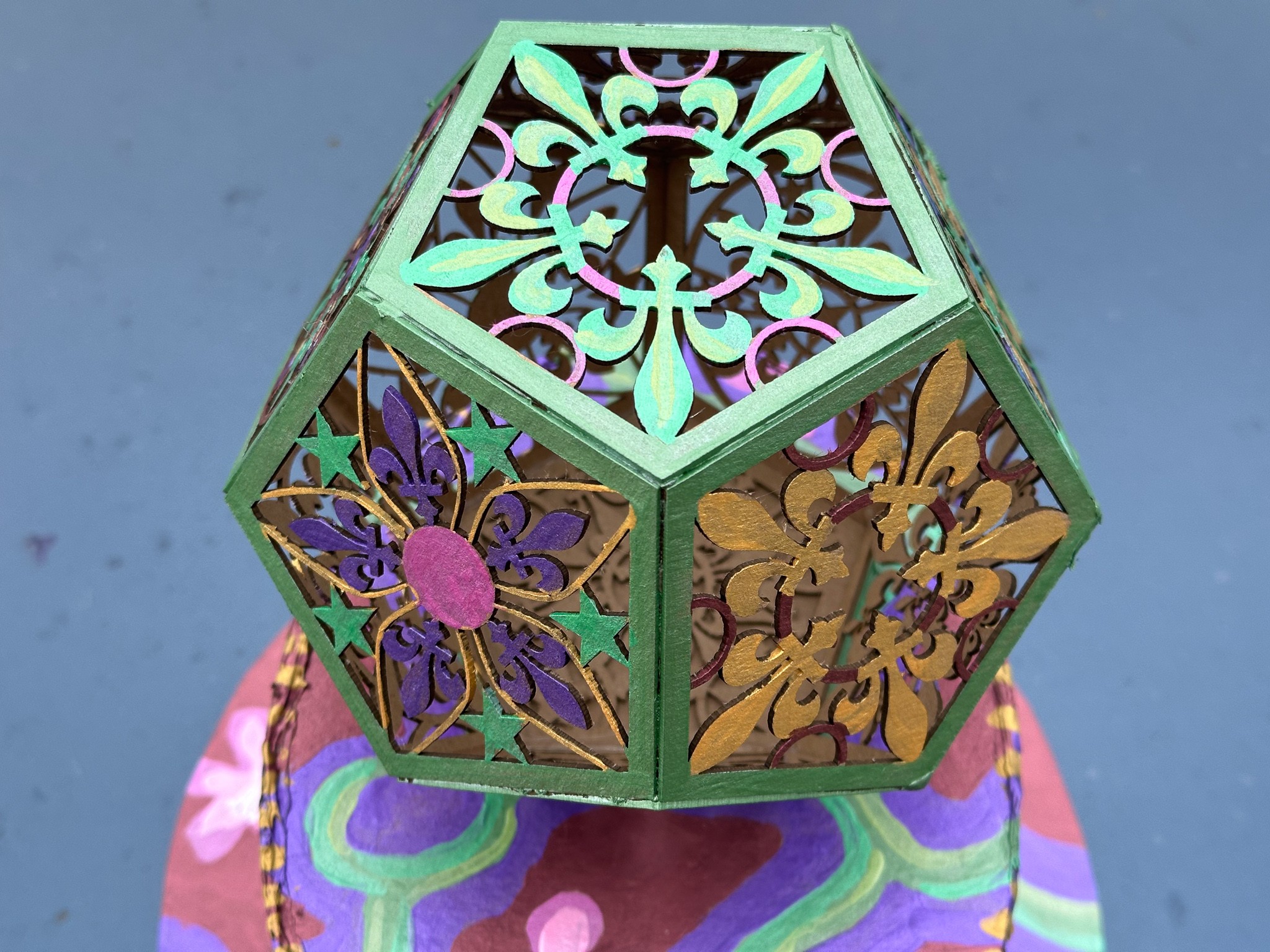
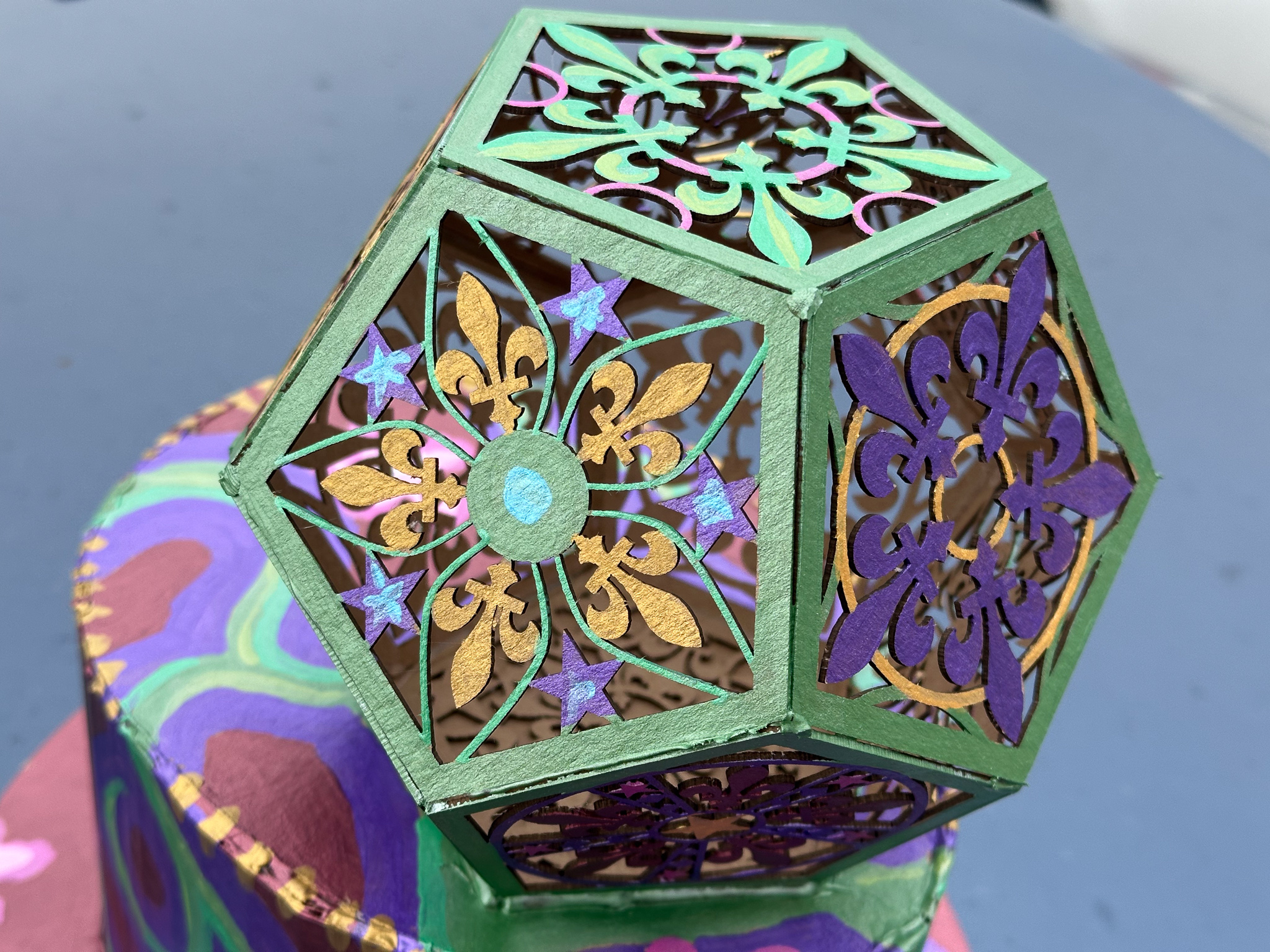
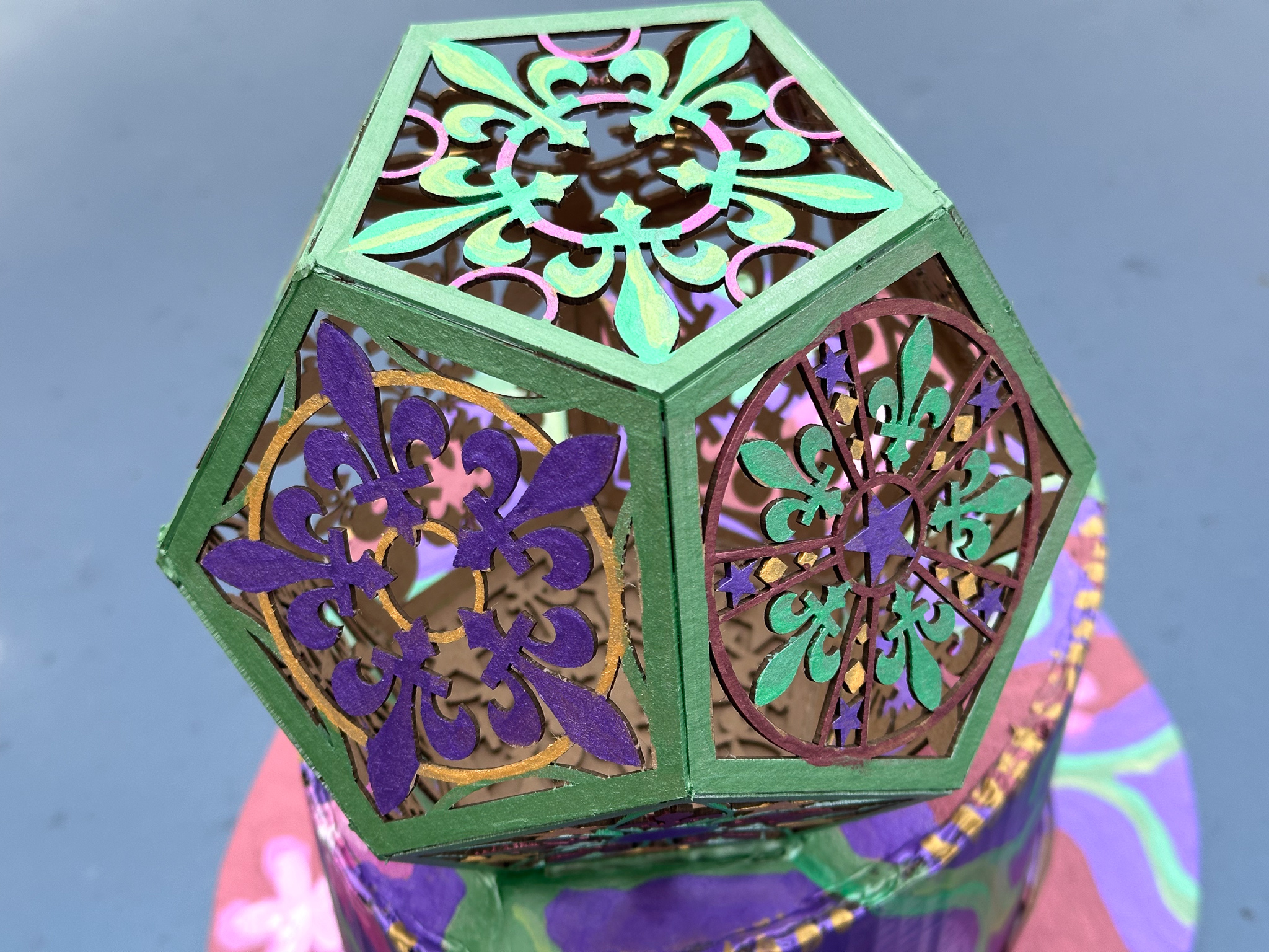
Then the hat part got put aside for a bit while the decoration was implemented. A dodecahedron is a geometric solid made of twelve pentagons. To add interest, I used Affinity Designer to illustrate a collection of pentagonal patterns based on fleurs-de-lis. You can download the design file as a PDF.

I took the file and a pack of acid-free chipboard to CrashSpace, and zapped out a bunch of pentagons on the trusty Epilog laser cutter. The chipboard comes in sheets that are 12 by 12 inches and “medium weight” which translates to 0.057 inches (~1.47mm) thick. Because the boards are not perfectly flat, the laser cutter doesn’t cut exactly the same across the entire sheet, meaning that some of the cut-out areas aren’t completely cut out.

In the vinyl- and paper-cutting crafts world, they refer to removing the cut-out portions from a design with the delightful term “weeding.” For most of the patterns, weeding just involves popping out the loosely connected portions. But there are places where I got poor through-cut. Also, the density of the chipboard is not very uniform, so some areas took a lot of cleanup with an X-Acto knife.

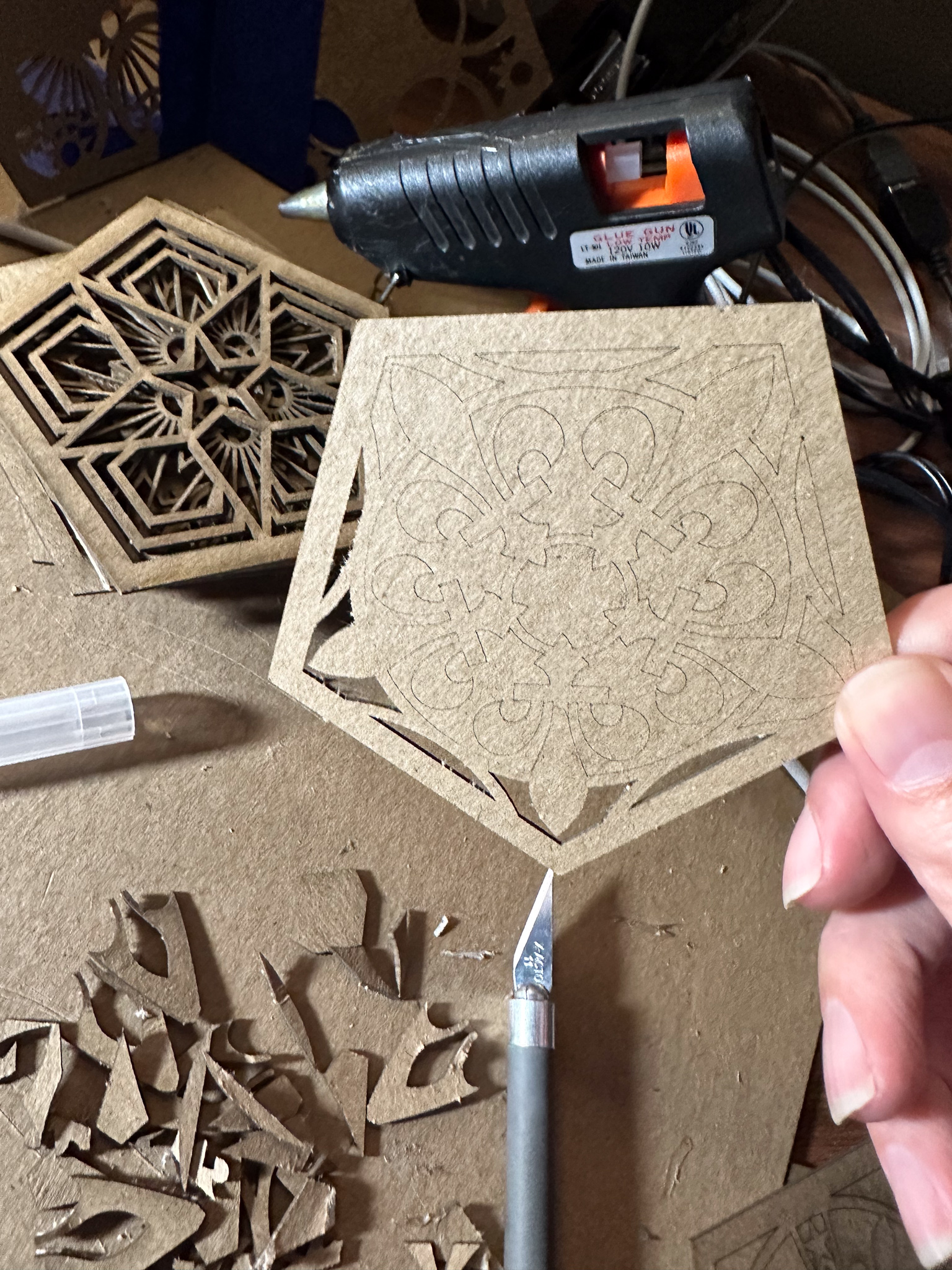
If I had been wiser, I would have recut these at a slightly slower speed to make sure there was complete cut-through.

Then, out came the hot-glue again, and the pentagons were assembled into a dodecahedron. You can kind of see in the lower left corner of picture below a temporary jig I made for positioning the pentagons into groups of three for rapid gluing. It’s not very precise, but fortunately it doesn’t need to be.

Next came painting. I have a set of metallic acrylic paints that were bought for last year’s Mardi Gras mask. In retrospect, I should not have bought them as the “metallic” effect is produced by tiny plastic flakes like glitter. Ugh. Micro-plastics. We’re all full of ’em, and it’s only getting worse. But I already have the paints, so I decided to use them.

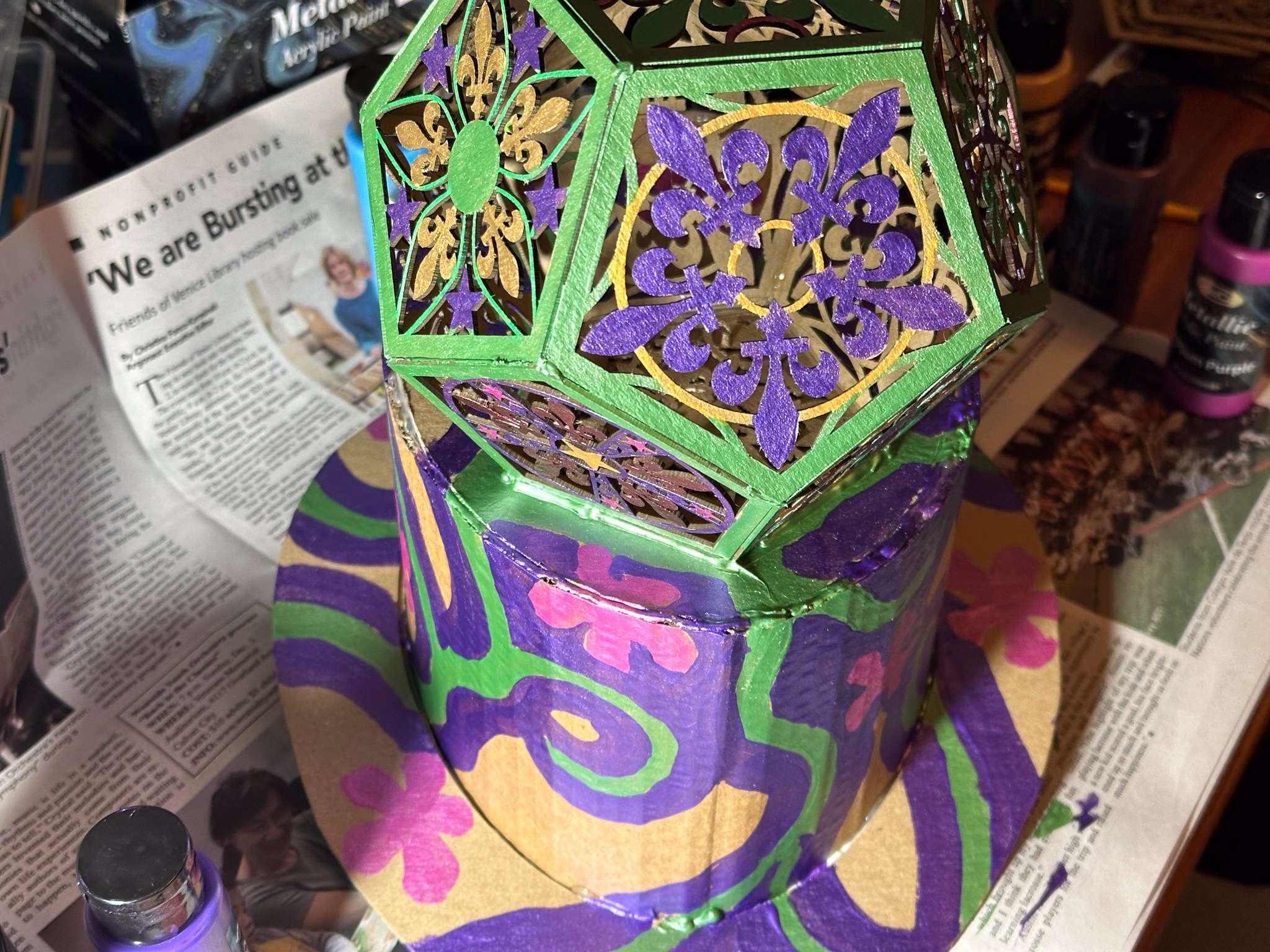
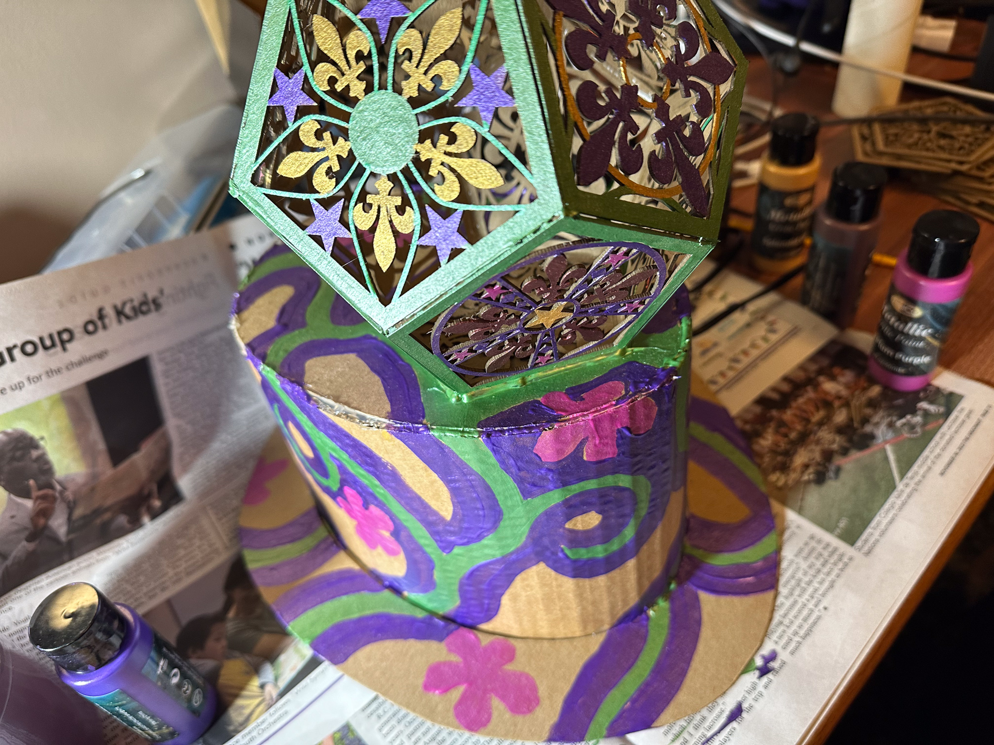
The final result didn’t end up looking half bad. I wore a not-terribly-clashing floral front-plate for my FloMask to complete the look.

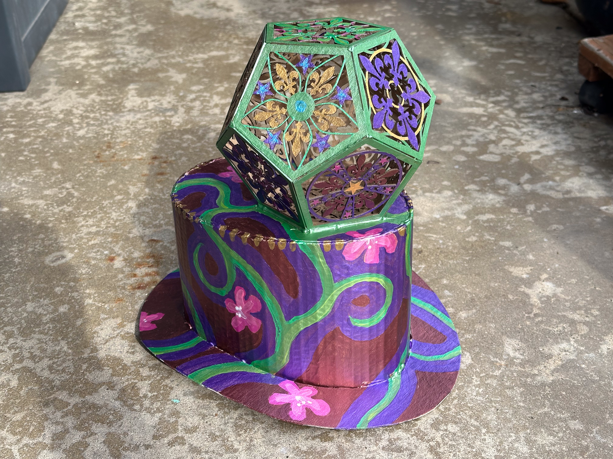
In the spirit of Mardi Gras, at the end of the parade, the hat was given to a school teacher whose students had just learned about dodecahedrons.


Sat, 9 Dec 2017

Laser Menorah

— SjG @ 6:49 pm

You know, this title is misleading. The reality is a whole lot more boring. Maybe next year, I should take inspiration from the title.

This is more of a lazy Saturday afternoon project. I wanted to use some designs that I’ve been kicking around. So I took a sea of hexagons and a tree in Affinity Designer and mucked about for a bit until I had something where I more or less liked the look.

Next, I grabbed a slice of poplar (available in 8″ x 24″ x 0.25″ slabs at Home Deport, as “Hobby Poplar”) and drove over to CRASH Space. While it’s mega-take-apart-day, I scurried over to the laser cutter. I converted the design to PDF, loaded it up in Corel Draw, used the Epilog printer-driver, and sent it to the laser cutter. The poplar cuts very nicely.

Here’s a link to the PDF of the laser-cut portion, if you want to cut a copy yourself.2017-12-09-hexonorah-cut.pdf

I brought the pieces home, sanded lightly, drilled a few holes, and mounted the vertical piece onto the base, carefully mis-aligning it with the major axis of the elliptical base. Ah well.

I drilled holes where I would mount the candle holders themselves (after all, poplar is pretty, but not ideal as a holder for things on fire). For the actual sockets, I used some nice quarter-inch brass compression caps (also from Home Depot). I drilled a center hole, pushed through a brad, and then soldered it with a torch.

Next, let things cool, dried off the sockets, and put it all together.

The final result is not as attractive as I had imagined it. It’s a little … I dunno, squat? Perhaps the next iteration will have more dramatic tree-like branches emerging to hold the candles.

OK. Next year, forget the design. We’ll just go with lasers.


Wed, 30 Jan 2013

Failures in Typographical Experimentation

— SjG @ 8:35 pm

This started with an idea.

Perhaps it would be interesting to create a family of type faces where the density of the characters was related to the frequency of their use. This font, to be called Densitas, would have variants based upon the text analyzed. For example, Densitas Shakespeare would use the collected works of Shakespeare for the character frequency corpus, while Densitas Brontë would use the works of the Brontë sisters for the corpus. For aesthetic purposes, perhaps the initial faces could be selected based on relevance to the source corpus as well.

What would this accomplish? It might reveal something interesting about the difference in usages between authors. It might end up being environmentally friendly by using less ink on more common characters. It might enhance readability. After all, it’s popularly understood that we tend to look at the shapes of words rather than the constituent letters. De-emphasizing the more common shapes may even make it easier to process text.

Any time I have an idea of this nature, I start thinking about code and design and try to avoid thinking about the end result. As my Father is wont to say, it is just as difficult to create something ugly as it is to create something beautiful. If I think too much on the end result, I will obsess over whether it will be worth the effort, and never get to the actual work. If I just dive in, I may find myself wasting a lot of time, but at least I will learn something.

This turns out to be one of those experiences. I thought it was an interesting idea. The end result is mediocre at best, dull perhaps, a waste of time. Still, I learned something in the process.

Step one was to write a character frequency analyzer. This code does a few things:

  • read a text file
  • compute the character frequencies
  • scale the results across the frequency range, so the least frequent character has a value of zero and the most frequent character has a value of one
  • map the characters to glyph names
  • write out a chunk of code to substitute into the next step

The next step is a FontLab Studio/RoboFab script, hence glyph names instead of raw character names. Since FontLab/RoboFab scripts are in Python, I figured I’d write this in Python as well (I don’t really know Python, but that kind of ignorance never stops me from writing code).

I ended up with this program: cf.py

I ran it against the plaintext
The Complete Works of William Shakespeare from Project Gutenberg
(after stripping out the Project Gutenberg-specific text, which I believe is permitted since I’m not redistributing the text, merely crunching it with code).

The FontLab/RoboFab script accepts two font sources, and interpolates each glyph according to the frequency computed in the previous step, where the less frequently used glyphs are darkest. For my test, I used the current state a sans-serif font I’ve been developing1. I have it in several weights, so I interpolated between the lightest and heaviest. The code to do this interpolation looks like shakespeare_weighter.py.

The results were unimpressive, to say the least:

(click to enlarge)

There are some of the obvious problems: distribution between is too stark; there seem to be only two or three densities. Similarly, kerning gets really disrupted by the different densities. But first things first. Why is the density contrast so extreme? Looking at the weighted frequency data answers that question:

For this chart, punctuation and other glyphs have been omitted.

So the next approach is to make the differences more gradual. Instead of doing by pure letter frequency, we use a gradient based on the ranking of frequency. In other words, the least common glyph is the darkest, the next least common glyph is one increment lighter, and so on, until the most common glyph is the lightest. This code to compute this looks like cf2.py, and the output distribution looks like this:

Looks more promising, does it not? We substitute the values into our FontLab/RoboFab script (like this: shakespeare_weighter2.py), and run it. Alas, the end results are still pretty dull:


(click to enlarge)

For the last try, we’ll do a few things differently. First, the thing that probably jumped out at you when you saw the first distribution graph: we’ll ignore all non-alphabetical characters when doing the frequency calculation. For the sake of readability, we’ll set all non-alphabetical characters to the median value. Secondly, we’ll take accented characters and consider them the same weight as their non-accented versions, so, for example, “á” and “ä” are the same density as “a.” Lastly — and this might be the big shift — we won’t interpolate between two weights of a font based on the frequency, but instead we will effectively halftone each glyph with a screen density based on the frequency.

To do this, we use the RoboFab halftoneGlyph() pen for inspiration. We do a much blunter approach: we impose a grid over the glyph, determine which points on the grid are inside, and replace those points with squares. The size of the squares is the same across a given glyph, and is based on the frequency. This process will then convert a nice, smooth glyph into a rougher, pixellated gray version of itself.

The revised frequency computation code is here (cf3.py), and the resulting frequency graph looks like this:

From this, we generate the final FontLab/RoboFab script (this one: shakespeare_weighter3.py), and run it.

And yet again, we look at the results, and sigh. All this work, and really nothing to show for it. There are a number of problems. The font stresses most rendering engines with its very high contour count, and either gets blurred into oblivion or converted into a plaid checkerboard nightmare when viewed on a display. The differences in shades are only apparent when the characters are enormous, even when printing. And, of course, aesthetically, it’s nothing to write home about.

(click to enlarge)

The lack of results are dispiriting enough to resort to quoting that reprobate Thomas Edison: “Results! Why, man, I have gotten a lot of results! I know several thousand things that won’t work.”

I can’t claim to know thousands of things that won’t work, but I do have another handful to add to the collection.

1 The font will be released as WL Hope Grotesque, when and if I ever complete it to my satisfaction.


Tue, 20 Dec 2011

Kerning Pairs

— SjG @ 11:22 pm

I’ve been playing around with font creation for a couple of projects (more on that will be posted here at some point). One of the more surprising aspects of computer typography is the sheer complexity of it — I may have once naively thought that just it was just a matter of splatting characters … er … glyphs out to some display device based on simple shapes, but I was sadly mistaken. In fact, True Type and its successor Open Type not only use complex mathematical equations for creating the curves that define font outlines, but they also contain rules for scaling, hints for rendering these “mathematically perfect” curves on a bit-mapped display, and metrics for spacing character combinations. Open Type has its own internal language for doing such complex tasks as replacing some glyph pairs with ligatures, or doing fancy substitutions of glyphs depending on the surrounding glyphs or other rules. This allows ambitious font designers to do such things as imitate handwriting or handle non-Roman languages naturally (for example, in Semitic languages, the same letter may be written quite differently if it’s at the beginning or end of a word, and sometimes also depending on where it is in the sentence).

There’s a lifetime of complexity in typography, and, as yet, I’ve only been swimming in the shallow end. Still, I was deep enough to be playing with kerning pairs. Kerning involves moving letters so they fit together nicely. For a visual demonstration and nice game, take a look here. This does more to explain kerning than anything I could write.

The program I’m using for font creation has a facility for creating kerning pair metrics. You can type in a pair of letters, and then adjust the spacing for that particular pair. Of course, you can’t really go through and tune them all1: consider the case where you only have upper case letters and digits from zero through nine. Neglecting accented characters, we’re talking 36 glyphs, or 666 combinations. Now throw in lower case, punctuation, etc, and you have an enormous list of possible combinations to tune.

But think about it for a moment. There are characters combinations that will want tuning in just about every kind of Roman-character-based font, like “VA” or “To” or “ij”. Equally, depending on your language, there are character combinations that will almost never need to be combined. For example, in English, you’ll almost never see a lowercase letter followed immediately by an uppercase, or combinations like “Yq” or “Td” or “zn” in sequence.

So in the interest of selecting kerning pairs intelligently, I wrote a script to analyze character combinations. My target audience is English-speakers, so for my source data, I used English-language texts. But which English texts to use? Being an absurdist, I selected Emma by Jane Austen, At The Mountains of Madness by H. P. Lovecraft, The Adventures of Tom Sawyer, by Mark Twain, An Inquiry into the Nature and Causes of the Wealth of Nations by Adam Smith, Alice, or The Mysteries, Complete by Edward Bulwer Lytton, Tales of the Jazz Age by F. Scott Fitzgerald, Tarzan of the Apes by Edgar Rice Burroughs, An Unsocial Socialist by George Bernard Shaw, the collected writings of Thomas Jefferson, the complete works of William Shakespeare, the Project Gutenberg license text, and the Unix version of the English Dictionary that lives in /usr/share/dict/words.

To analyze the data, I loaded up the text, and stripped out all but the letters, digits, and the following punctuation: period, single-quote, double-quotes, exclamation mark, question mark, comma, semicolon, colon, left parenthesis, and right parenthesis2. I took all of the two-character combinations, and filtered out all pairs where one character was a space. Then I simply counted the number of instances.

Of course, the statistical analysis doesn’t match the experience of reading. While the frequency of combinations that start with an uppercase character followed by a lowercase character is low, those are possibly more important than combinations of lowercase characters. After all, they start out each sentence, and are very visually prominent. Additionally, the shapes of letters increases the propensity of these combinations to need kerning adjustments. With these thoughts in mind, I generated a file of statistics from the same texts, but based solely on combinations containing an uppercase character.

You can download the lists for your own nefarious purposes. Here’s the complete list, and here’s the list containing caps. In the complete list, there is what appears to be bad data. Keep in mind that the text contained such things as Roman Numeral chapter headers, older style numeric abbreviations (e.g., “3dly” and “23d”), some currency abbreviations (e.g., “1s.6d” or “1/6d”, both of which stand for 1 shilling and sixpence), and poetic contractions (e.g., “oer,” “stol’n,”, or “capdv’d”). I also see what I suspect are errors due to imperfect OCR of the original texts.

Last, but not least, I have two files which are my collection of The 128 Vitally Important Kerning Pairs and The 255 Important Kerning Pairs With One Repeat which comprise the most common combinations from the other two files as a single text for examination when testing a font.

1 Ideally, the way you define the spacing of the glyphs themselves saves you from having to tune all combinations. Most should start out looking pretty good. But you do, of course, want your font to lay out perfectly, hence the rest of this discussion.

2 This was admittedly an arbitrary choice of allowable punctuation. I also excluded accented characters like ü and à which would obviously need to be taken into consideration for many European languages. Since my focus was on English, I deemed them rare enough to ignore.


Tue, 18 Oct 2011

Publishing Old Projects

— SjG @ 9:52 pm

I’ve been publishing a bunch of old projects that I may have posted here, or simply left on my hard drive to suffer the slings and arrows of outrageous bit-rot. Most of these are projects that I created for some specific purpose or another, and have either coded to the point where I’m satisfied with them, or abandoned them.

I’m publishing this stuff in the hopes that it’ll be useful to somebody somewhere. In some cases, the code’s primary use may be as an example of how not to accomplish a task. In other cases, they’re projects that are being used in mission-critical operations, and so are reasonably robust.

I’ll be maintaining them on GitHub, if you want to get creative with the definition of “maintaining.”